To create a successful app, it's not enough to simply have a brilliant concept. The design and functionality of your app, specifically its Mobile User Experience (UX), are crucial components for its success.
Consider this striking statistic:
“…the average app loses 77% of its DAUs within the first 3 days after the install.” — Andrew Chen
To combat this trend and retain more daily active users, providing an exceptional mobile app user experience is key. In this guide, you will learn the fundamentals of designing a great mobile application that makes users happy.
Summary - Mobile UX design
| Question | Answer |
|---|---|
| What is Mobile UX Design? | Designing user experiences for mobile apps, focusing on interaction and emotions. |
| Why is Mobile UX Design important? | Good mobile UX boosts satisfaction; 57% won't recommend poor mobile design. |
| What are the principles in Peter Morville's honeycomb? | Useful, Usable, Desirable, Findable, Accessible, Credible. |
| How can designers implement these principles? | User research, mobile-first approach, responsive design, iterate with feedback. |
| Key differences between desktop and mobile user experience design? | Size, orientation, navigation, input, environment, user behavior differ. |
| How to account for screen orientation in mobile UX? | Ensure layouts adapt seamlessly to portrait and landscape modes. |
| How do navigation and input differ on mobile? | Mobile uses touchscreens and gestures; desktops use mouse and keyboard. |
| How to ensure seamless UX/UI across mobile and desktop? | Maintain consistent design, features, and experience across platforms. |
What is Mobile UX Design?
Mobile UX is the subjective experience a user has with a mobile app.
UX designers are tasked with crafting products that are not only enjoyable to use but also deliver a pertinent and impactful experience for users. In the realm of mobile UX design, it's essential to take into account the complete customer journey, which includes all aspects of interaction, content, and even sound design.
Understanding the distinction between UX (User Experience) and UI (User Interface) is vital. UX design involves far more than the visual components of the UI. In mobile UX design, the focus extends beyond mere visual aesthetics to encompass the emotional responses, objectives, and obstacles faced by users.
Why Is Mobile UX Design Important?
57% of users say they won't recommend a business with a poorly designed mobile presence.
The goal of mobile UX designers is to design the experience that users have before, during, and after using the app.
The design should be useful, usable, desirable, findable, accessible, and credible, as outlined in Peter Morville's user experience honeycomb.
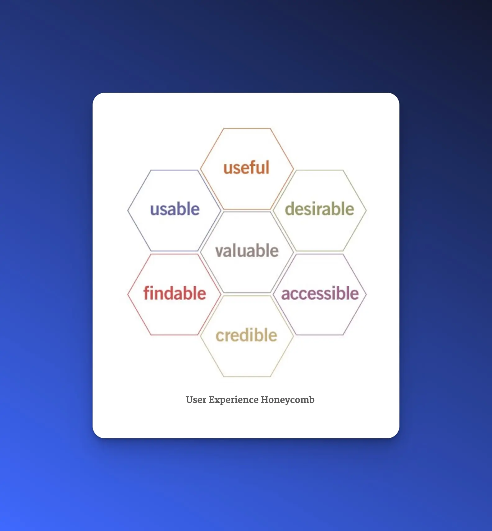
Useful: The system must fulfill the users’ wishes and needs.
Usable: The system must be as easy and self-descriptive as possible.
Desirable: The style of the system must evoke positive emotions and appreciation. Users must want to use your system.
Findable: Navigating through the system must be easy and self-descriptive. Moreover, users must find important information quickly.
Accessible: Disabled users, e.g., users with very poor eyesight, must have the chance to use your system and get the same user experience as non-disabled users.
Credible: Users must trust you and your product.
To implement these principles, designers should:
Conduct user research to understand their target audience and their needs.
Create user personas and scenarios to guide their design decisions.
Use a mobile-first approach, prioritizing the most important content and interactions for the mobile experience.
Use responsive design to ensure that the design adapts to different screen sizes and orientations.
Pay attention to the visual design of the mobile UX, using a consistent color palette, typography, and imagery.
Use appropriate visual cues, such as icons and buttons, to guide users through the interface.
Consider the use of animations and micro-interactions to enhance the user experience and provide feedback to users.
Finally, designers should iterate on their designs based on user feedback and analytics data to continuously improve the mobile UX.
What Are the Differences Between Desktop and Mobile App UX Design?
To give your users the best experience possible, you must know the differences between desktop and mobile app UX design. You shouldn’t follow the same design principles for both.
1. Size

Desktop: Computers are big, so you can put a lot of information on one page and it will still look great and organized.
Smartphone: If you were to shrink your website to the regular size of a 4-5 ½ inch mobile device without changing anything, it would look awful and confuse your users.
Pay attention: You have to decide which information is important enough to make it to a smartphone design. If something doesn’t need to be there, skip it, or place it under a menu or on another page.
Moreover, because of the bigger screen size of desktops, you can arrange your content in several columns next to each other. For a great mobile UX design, you have to structure your content in just one column. Users scroll down to see all the content.
Session replay is a valuable tool that allows you to see how your mobile app performs on different device sizes and configurations. You'll be able to observe real user journeys and uncover opportunities for improvements - all while getting a better grip of how customers engage with the product. Whether it's discovering device-specific problems or identifying areas that need improvement, session replay will help you acquire invaluable feedback from users.
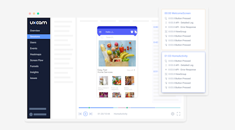

It can reveal a range of potential issues with its performance, such as content that is too small to read or buttons that are placed too closely together on touchscreen devices, which can make them difficult to accurately tap. With UXCam's session replay, you can fine-tune your mobile UX design to ensure that users have a seamless and enjoyable experience no matter what device they are using.
2. Screen orientation
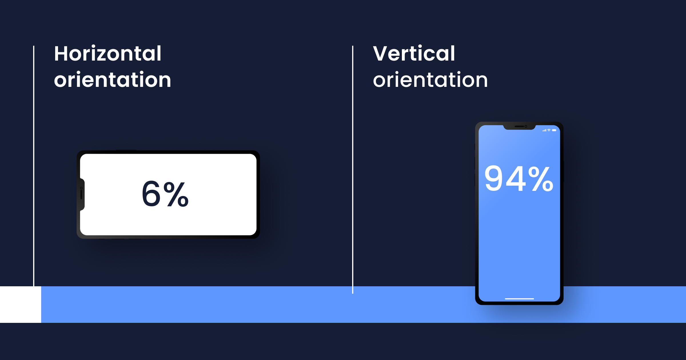

Desktop: They are horizontally oriented. Users can’t change this orientation.
Smartphone: On mobile devices, users have the option to change the screen orientation if they want. 94% of users use their smartphone vertically, while 6% do so horizontally.
Designers should take this into consideration when creating mobile interfaces. Portrait mode is typically better suited for tasks that involve reading and scrolling, while landscape mode is better suited for tasks that involve watching videos or playing games.
Designers should also keep in mind that users may switch between orientations depending on the task they are performing. For example, a user may switch to landscape mode to watch a video and then switch back to portrait mode to read an article.
To accommodate this, designers should ensure that the layout and design of the interface adapt seamlessly to different screen orientations. This means that the layout should be designed to work well in both portrait and landscape mode and that the design elements should be optimized for both orientations.
You can track changes in behavior based on screen orientation with heatmaps.
For example, a heatmap may show that a button placed at the bottom of the screen is not getting enough attention in portrait mode, but is getting more attention in landscape mode. This information can help designers make informed decisions about how to optimize the layout and design for different orientations.
UXCam's heatmaps can also be used to track user behavior over time, which can be especially useful when comparing usage between different screen orientations. This can help designers understand how users engage with the interface over time, and can help identify any changes in behavior that may be related to changes in screen orientation.
3. Screen size
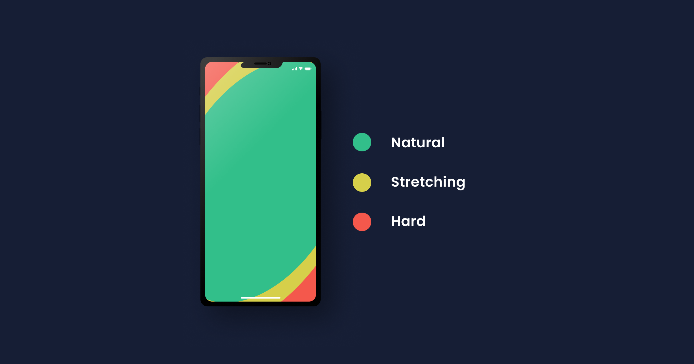

UX designers must take into account the fact that many users prefer to use their mobile phones with one thumb. 49% of users prefer to use their mobile phones with just one thumb.
The bigger the screen size, the fewer points that can be reached comfortably with one thumb. This means that the layout and design of the interface should be optimized for one-handed use, with important elements and buttons placed within easy reach of the thumb.
Furthermore, this also means that designers should be mindful of the screen size when designing for mobile devices. The larger the screen size, the fewer points on the screen can be comfortably reached with one thumb. This means that designers must carefully consider the placement of elements and buttons on larger screens to ensure that they are easily accessible for one-handed use.
Pay attention: To make sure that the mobile app or website is easily accessible for one-handed use, designers can use techniques like:
Placing important elements and buttons within the thumb's reach.
Utilizing gesture-based navigation to minimize the need to reach for buttons.
Making sure that the layout is consistent across different screen sizes.
Avoiding placing important elements or buttons at the top or bottom of the screen, as these areas are harder to reach with one thumb.
By taking these factors into account, designers can create mobile interfaces that are comfortable and easy to use for the majority of users, regardless of screen size.
Again, heatmaps can be a valuable tool for analyzing user behavior on different screen sizes.
For example, heatmaps can show how users engage with the interface on small screens, such as those of smartphones, versus larger screens, such as tablets. A heatmap may show that a button placed at the bottom of the screen is getting a lot of attention on a smartphone, but is not getting enough attention on a tablet. This information can help designers make informed decisions about how to optimize the layout and design for different screen sizes. You can use UXCam's mobile app heatmaps for free.
4. Navigation and input

Desktop: A keyboard and a mouse are the most common input devices for desktops. Sometimes you will find desktops with a touchscreen but, even then, those tend to have an additional mouse and keyboard of their own.
Smartphone: On a mobile device, users don’t have a mouse or a physical keyboard to rely on. To type or select elements, mobile device users have to use their touchscreens.
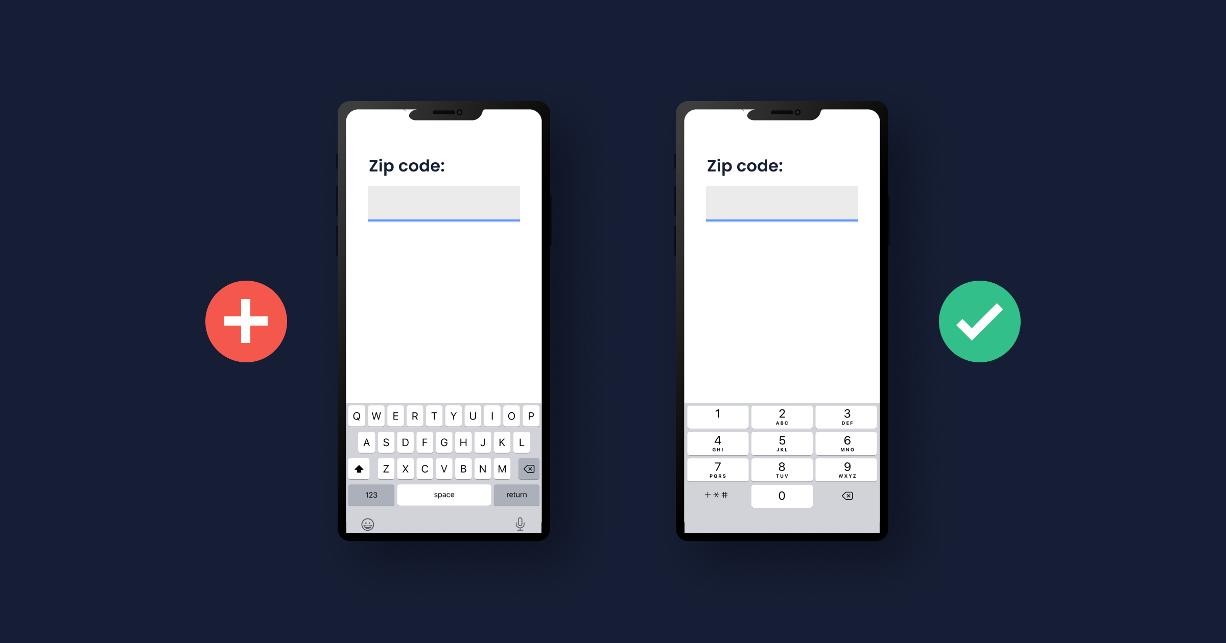
Pay attention: If your users have to type anything — for example, during the sign-in process — you should offer them a keyboard. Help your users and make the input much more comfortable by offering them different keyboards depending on what they have to enter.
If the information requested by you is a phone number or a ZIP code, a normal keyboard won’t do; offer them a numeric keyboard instead.
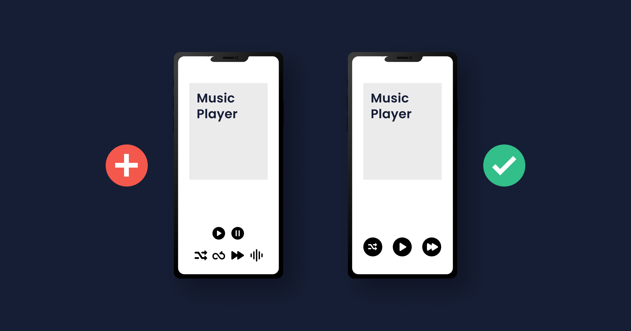

The size of the action icons is also important. Too many action icons too close to each other, and the chance of missteps is high. Make sure that the buttons are big enough to be tapped with a finger.
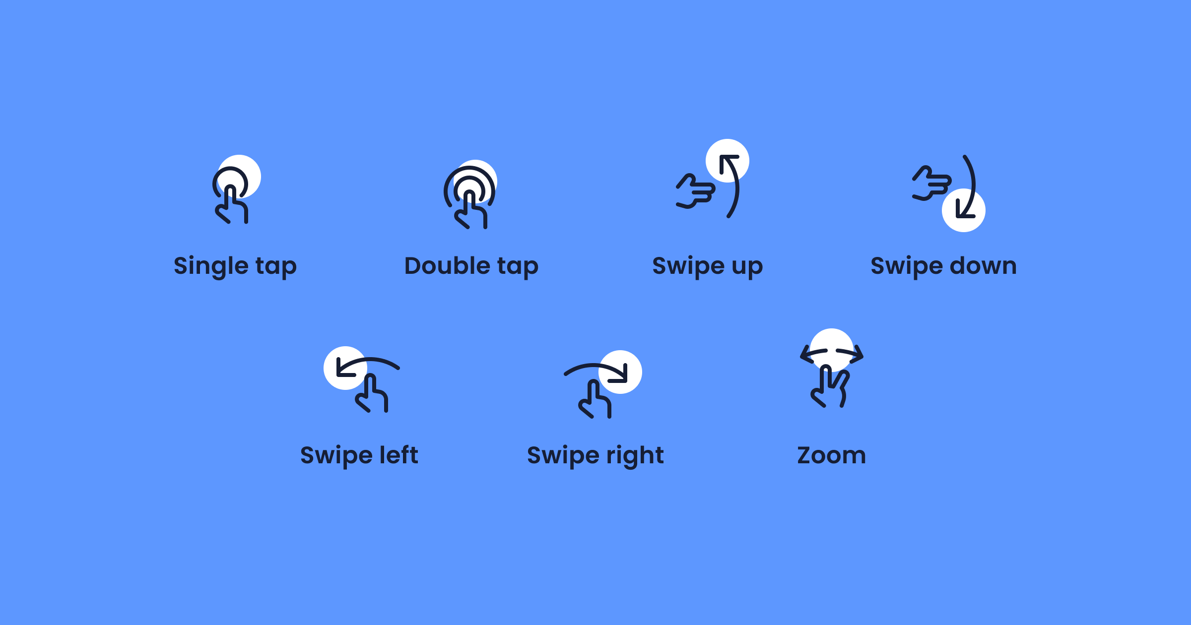

Mobile devices go beyond allowing users to touch buttons; there are other gestures that users can perform. The most common ones are scrolling, sliding, pulling down, and tapping (long, short or double taps). Pulling down, for example, is a common gesture for refreshing a page.
By analyzing user gestures, such as taps, swipes, and scrolls, you can gain a deeper understanding of how users navigate your mobile app and identify areas for improvement. UXCam is a mobile app analytics tool that enables you to track user gestures in real-time, providing valuable insights into how users interact with your app.
For example, you may discover that certain buttons or links are difficult for users to tap accurately, or that certain screens are causing users to become frustrated or confused. With this information, you can make changes to your app's user interface and design to improve the overall user experience. Overall, tracking user gestures with UXCam can help you to optimize your app's UX and ensure that it is as intuitive and enjoyable as possible for your users.
5. Environment
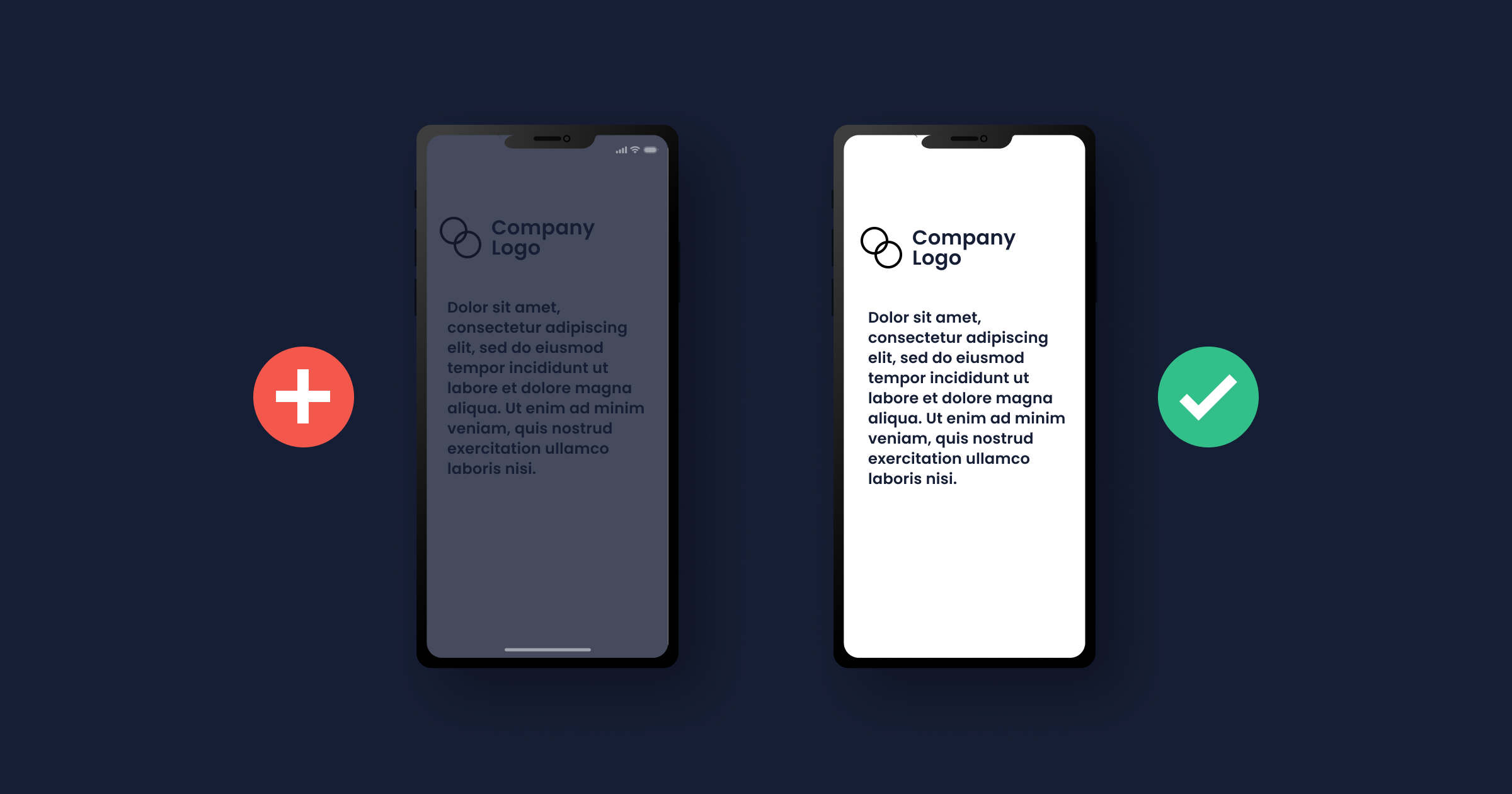

Desktop: Users often use desktops for more serious or important tasks e.g., working in the office or shopping.
Smartphone: Mobile phones provide more personalization than desktops. That is why they are used everywhere; at the restaurant, at home, in the bathroom… anywhere. Sure, you can install a desktop PC in your bathroom or take it with you on the subway to read the news. But most users will go for their smartphone in this kind of situation.


Pay attention: Realizing that users will access your app anywhere leads you to understand that your app should be easy-to-use outdoors. Design your app with high-contrast colors to ensure that your users can read everything, even if the sun is shining on their smartphone.
Sometimes, users don’t trust mobile apps. They may second guess giving their private data away to a mobile app. To not overstrain your users, only ask for what is really important for using the app. Minimize the need for input for a perfect mobile design.
This doesn’t mean that you should add unnecessary questions to a desktop app. Even on desktops, users will drop off if they feel like you’re asking for too much information.
6. Split Screen
Desktop: Users sometimes open several apps and websites simultaneously. For example, your app and a calculator. They can have them both open at the same time side by side.
Smartphone: Newer smartphones support split screens too, but it still isn’t a commonly used feature, definitely not as much as on a desktop.
You should care about most of your users, who probably have smartphones without the split-screen function. If users need to compare exchange rates or check the location of a town to fully use your app and you don’t offer this functionality, they may have to leave your app to open a calculator or Google Maps.
The issue here is that with this comes the temptation to completely close the app, whether consciously or subconsciously. Sometimes users forget that they were on a different app to begin with because they get distracted by another one. Other times they get annoyed at apps that don’t come with everything they need to properly use them.
Try to keep users on your app by offering them everything they need. Moreover, don’t take users to a browser to complete actions like registration or login.
7. Symbols
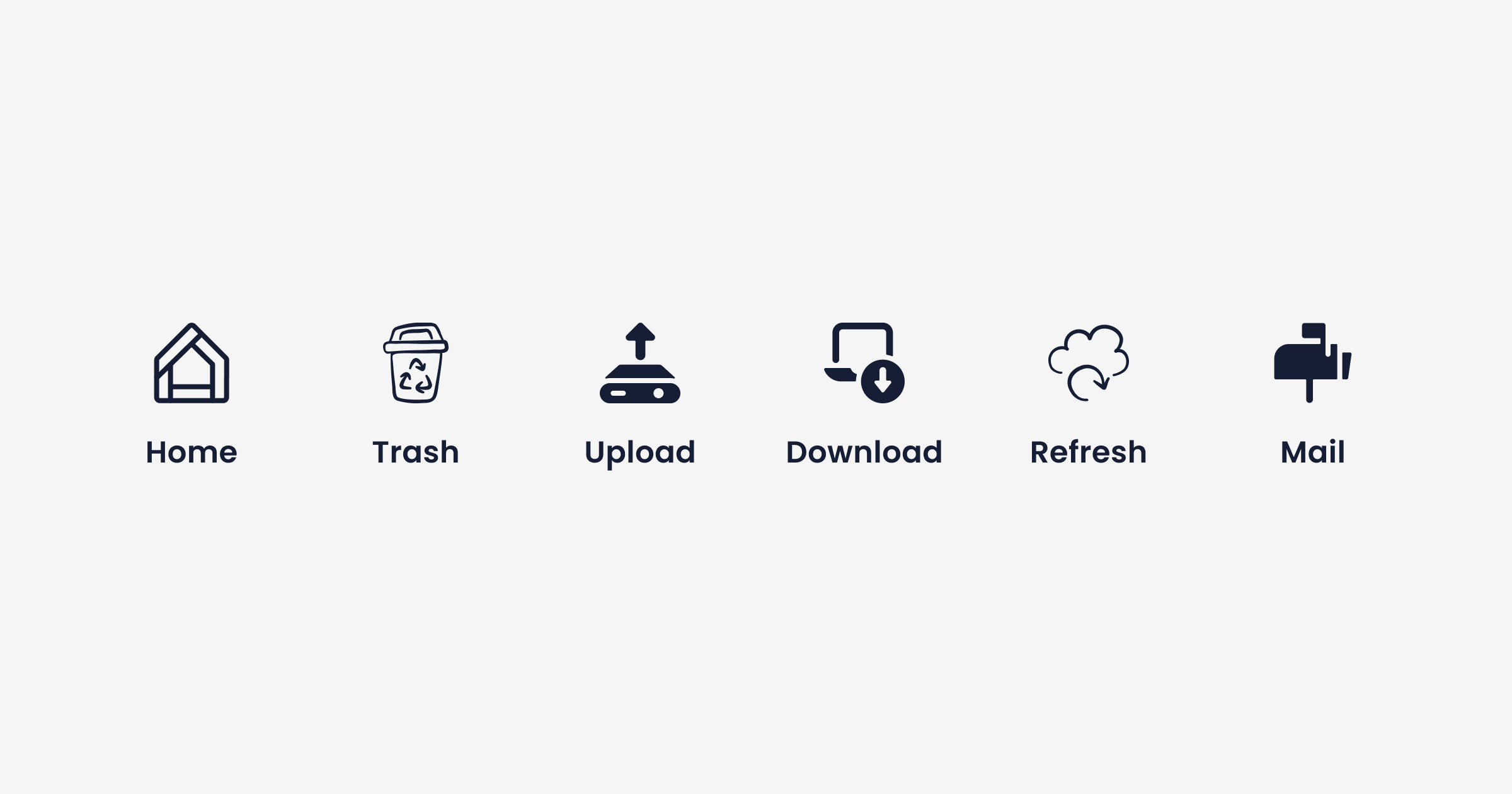

Symbols are relevant for both desktop and mobile devices. When users go on different apps, they learn the meaning of common symbols and icons.
Ensure that you use typical symbols how they’re usually used. The unexpected use of symbols confuses users and they may not want to continue using your app.
8. Seamless UX/UI Design


If you want to offer your app for both mobile and desktop devices, you need to consider creating a seamless design.
This means that your design should be recognizable regardless of whether your users go for the mobile or the desktop app. The features should be similar too — if not the same — and your users should feel that both apps act as one.
If you want to learn more about mobile UX, we recommend enrolling in our course "Mastering Mobile App Product Management" for free.
This course delves into user research techniques, helping you understand the users’ needs and behaviors, which is crucial for designing a UX that is both engaging and intuitive. With modules like "How to Map Out Your Discovery" and "User Research for Mobile Apps," we provide practical insights into identifying user needs and crafting a user experience that is not only visually appealing but also functional and satisfying.
Mobile UX best practices
You're designing for users who are always on the go. They expect quick, seamless experiences on their mobile devices.
Your goal is to create an app that not only looks good but also works effortlessly. This involves understanding user needs and crafting an interface that meets those needs effectively.
Below, we'll explore best practices to help you design exceptional mobile user experiences.
1. Understand your users
Understanding your users is the foundation of great mobile UX design. Start by conducting thorough user research.
Create user personas that represent your target audience. These personas help you empathize with users and make informed design decisions.
Consider:
Goals and motivations: What are users trying to achieve?
Pain points: What challenges do they face?
Behaviors and preferences: How do they interact with apps?
By knowing your users, you can tailor the app to meet their specific needs.
2. Mobile-first approach
Adopting a mobile-first approach means prioritizing the mobile experience over desktop. Focus on what's essential for mobile users.
Simplify the user interface by:
Including only necessary features
Removing clutter and distractions
Streamlining navigation paths
This keeps the app uncluttered and easy to navigate.
Designing for mobile first ensures your app performs well on small screens. It also sets a strong foundation for scaling up to larger devices.
3. Responsive and adaptive design
Your app should work seamlessly across various devices. Use responsive design techniques to adapt the layout to different screen sizes.
Ensure that:
Content adjusts automatically
Images and text scale appropriately
Navigation remains consistent
Consider both portrait and landscape orientations. Design interfaces that look good and function well in both modes.
4. Touch-friendly interfaces
Since users interact with mobile apps using touch, make sure your interface is touch-friendly.
Tips for touch-friendly design:
Use buttons at least 44x44 pixels
Place interactive elements within easy thumb reach
Provide ample spacing between touch targets
Design for one-handed use. Place important controls where they can be easily accessed with the thumb.
Avoid small touch targets that are hard to tap. This reduces user frustration and improves overall usability.
5. Consistent visual design
Consistency in visual design enhances user familiarity. Use a consistent color palette, typography, and iconography throughout the app.
Maintain a clear visual hierarchy by:
Using headings and subheadings
Differentiating button styles
Highlighting important elements
Consistency builds trust and makes your app feel professional.
6. Simplify navigation
Keep navigation simple and intuitive. Use standard navigation patterns that users are familiar with.
Best practices for navigation:
Use a clear menu structure
Limit the number of menu items
Provide a search function if needed
Minimize the steps required to complete tasks. This makes the app more efficient to use.
Consider using gestures for navigation, like swiping, where appropriate.
7. Accessibility
Design your app to be accessible to all users, including those with disabilities.
Accessibility considerations:
Use high-contrast colors for readability
Ensure text size is adjustable
Provide alternative text for images
Support screen readers and assistive technologies
By making your app accessible, you reach a wider audience and provide a better experience for everyone.
8. Performance optimization
Optimize your app's performance to ensure quick load times. Users expect apps to load instantly.
To improve performance:
Compress images and media files
Minimize resource usage
Optimize code by removing unnecessary elements
Efficient performance enhances user satisfaction and encourages continued use.
9. Provide feedback and interactivity
Use animations and micro-interactions to provide feedback. This makes the app feel more responsive and engaging.
Examples of feedback:
Button animations on tap
Loading indicators during data fetch
Success messages after actions
When a user performs an action, let them know it's been recognized. Interactive feedback helps users understand the results of their actions.
10. Testing and iteration
Testing is essential to refine your app. Use analytics and gather user feedback to identify areas for improvement.
Methods for testing:
Conduct usability tests with real users
Perform A/B testing on different designs
Analyze user behavior through analytics tools
Iterate on your design based on these findings. Continuous improvement leads to a better user experience.
FAQ
Related Articles:
10 Best app design practices for app development
Best behavioral analytics tools to optimize mobile app UX
Push Notification UX: The Full Guide
The Complete Overview: Gestalt Principles
“Please Reconnect” — Offline UX in Mobile Apps
AUTHOR
Annemarie Bufe
Product Analytics Expert
Passionate hobby dancer. Working at UXCam.

Related articles
Curated List
7 Best AB Testing Tools for Mobile Apps
Learn with examples how qualitative tools like funnel analysis, heat maps, and session replays complement quantitative...

Jane Leung
Product Analytics Expert
UX design
How to do a UX competitor analysis + template
Curious to know why you should do an app UX competitor analysis? Keep on reading and then benefit from our free UX competitive analysis...

Marilyn Wilkinson
UX design
Mobile UX Design: The Ultimate Guide 2026
"Design is not just what it looks and feels like. Design is how it works." — Steve...

Annemarie Bufe
Product Analytics Expert


