Back to blog
12 MIN READ
B2B SaaS Funnel Conversion Benchmarks - What’s a Good Rate at Every Stage?
PUBLISHED
15 May, 2025


Your B2B SaaS team is not suffering from a lack of data, they suffer from not knowing how to measure what matters. You might have asked: “Are our conversion rates where they should be?”
This guide gives you exactly that. It breaks down up-to-date conversion rate benchmarks across the key stages of a modern B2B SaaS funnel and shows you what’s average, what’s exceptional, and what’s worth fixing now.
You will also get the tools and strategies to act on what you find, so you can stop guessing and start optimizing with confidence.
What’s a Good B2B SaaS conversion rate?
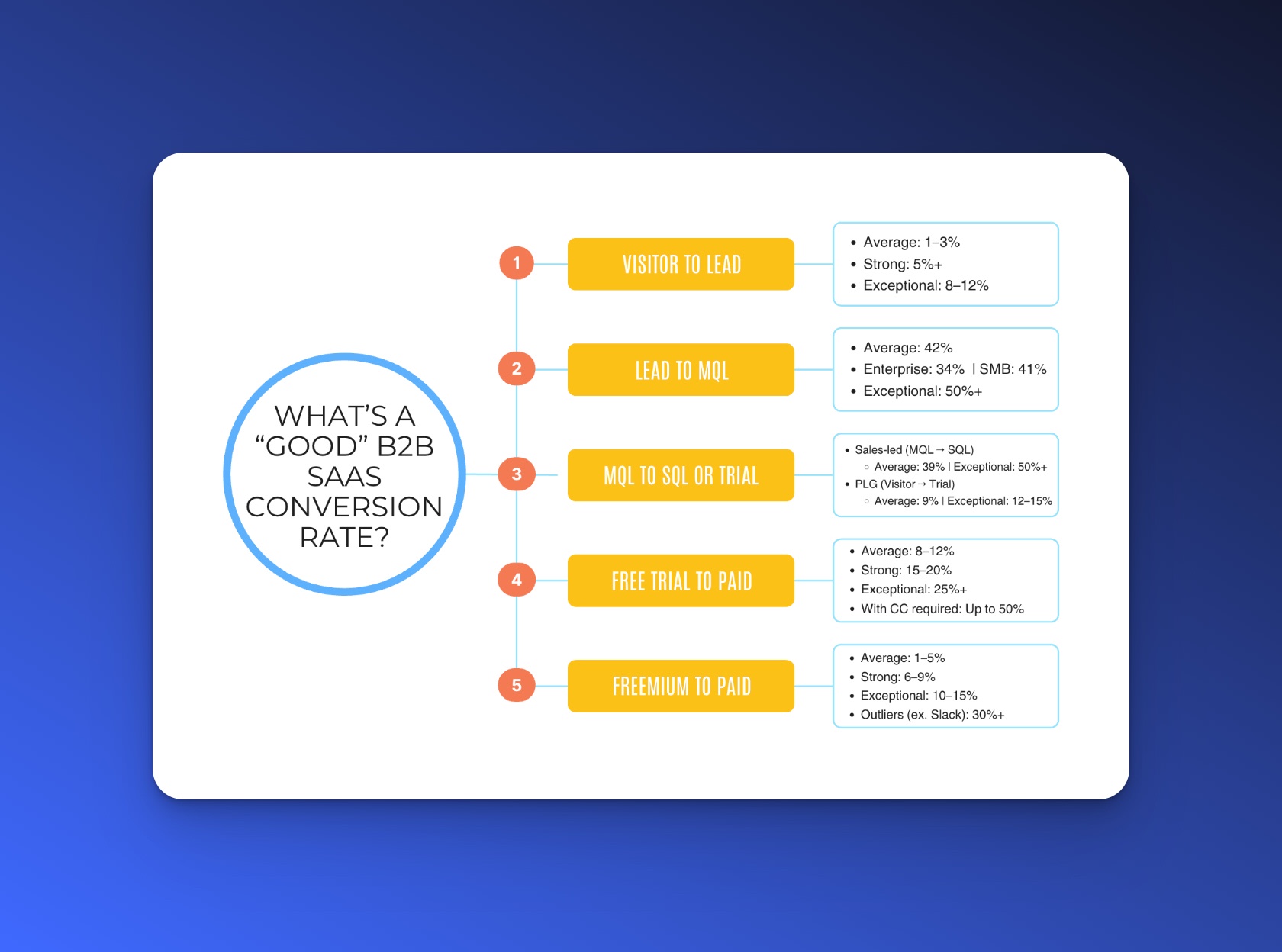
What counts as “good” depends on your model, pricing, and audience. But these 2025 benchmarks offer clear targets to measure against. Use them to see where you stand and where to improve:
Here’s a quick snapshot of these benchmarks:


Benchmarks aren’t fixed rules, but they do reveal what’s typical vs. top-tier. If you are below average at any stage, that’s your best opportunity to improve and drive meaningful growth. Let’s dive into each one deeper.
What affects your funnel conversion rates - 4 core factors
Conversion rates don’t exist in a vacuum. Before you compare your numbers to any benchmark, look at the context behind your funnel. These 4 factors directly influence how well you convert visitors to customers:


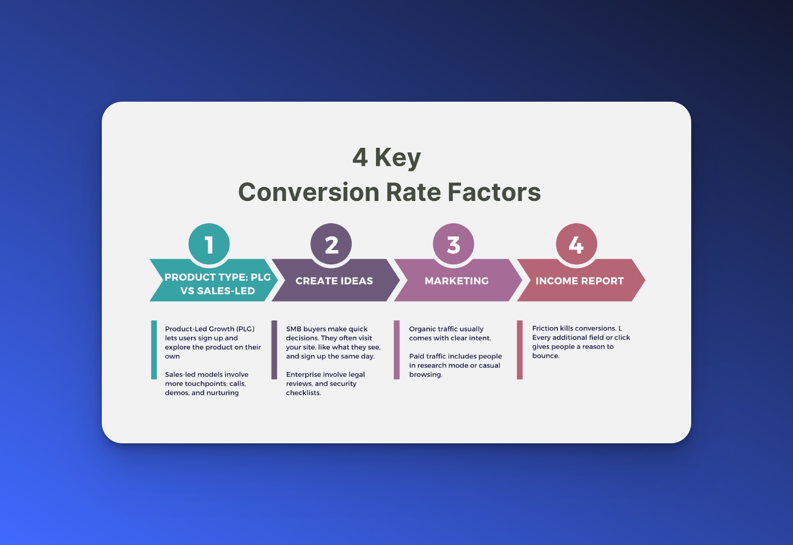
1. Product type: PLG vs sales-led
Product-Led Growth (PLG) lets users sign up and explore the product on their own. You rely on UX, onboarding, and in-product value to convert. PLG funnels often show higher top-of-funnel conversion rates because users experience the product before committing.
Sales-led models involve more touchpoints: calls, demos, and nurturing. You build trust before showing the product. This model converts slower but usually targets higher contract values.
If you use a sales-led approach, expect lower sign-up rates but focus on improving lead-to-close performance.
2. Target customer size: SMB vs enterprise
SMB buyers make quick decisions. They often visit your site, like what they see, and sign up the same day. You can push them through the funnel with a clear CTA and a low-friction trial.
Enterprise customers take longer. They involve multiple stakeholders, legal reviews, and security checklists. They prefer custom demos or pilots over quick trials.
Take a medical device supplier. A consumer searching for the best option isn’t going to request a sales call. They will want to read device comparisons like this, evaluate features, and make a quick decision. That’s why they help buyers feel confident fast with clear, accessible product breakdowns.
If your buyers behave more like individual decision-makers than procurement teams, remove unnecessary friction and speak directly to urgency.
3. Traffic source & intent
Organic traffic usually comes with clear intent. These users search for solutions, read your blog, or come through referrals. They trust you more and convert higher.
Paid traffic brings reach but often includes people in research mode or casual browsing. If your ad messaging and landing pages feel mismatched, you will see drop-off fast.
Similarly, you cannot ignore the growing concern around digital trust. With 63% of adults facing at least one cyber attack, users are more cautious than ever about where they click and who they buy from.
This makes message clarity, security signals, and brand consistency even more critical in converting traffic, especially from paid sources.
Traffic quality matters as much as quantity. Someone arriving from an article titled “How to start a business in Australia” might just be curious. But someone searching “buy a business in Melbourne under $500k” already knows what they want.
For this, observe how platforms like BusinessForSale convert well with the right search terms. Pay close attention to how they meet high-intent users with high-relevance listings.
Map your landing pages to high-intent keywords. Don’t treat top-funnel blog readers the same as ready-to-buy visitors.
4. Sign-up friction
Friction kills conversions. Long forms, required phone numbers, unclear CTAs, or hidden pricing introduce resistance. Every additional field or click gives people a reason to bounce.
For example, a form with one input field had a 3.20% conversion rate, while a form with 5 input fields had a much lower 0.81% conversion rate.
When users don’t know what happens next (“Will I get a demo or an annoying sales call?”), they hesitate. That hesitation shows up in your conversion rate.
If your rate is low at the top of the funnel, simplify the path to action. Show what happens next and reduce the ask.
Your conversion rates don’t just reflect how good your offer is, they reflect how well your model, audience, traffic, and UX work together. Before you fix numbers, work with a business expert and a frontend developer and fix context.
SaaS funnel benchmarks - What’s normal vs what’s exceptional (By Funnel Stage)
Use these benchmarks to expose weak spots in your funnel, decode what’s holding conversions back, and know exactly where to take action.
1. Visitor to Lead conversion rate
This tracks how many website visitors convert into leads by filling out a form, starting a trial, or requesting a demo. It tells you how well your site captures interest.
| Performance Level | Conversion Rate |
|---|---|
| Average | 1–3% |
| Strong | 5%+ |
| Exceptional | 8–12% |
Where To Find Your Data
Use Google Analytics or GA4 for total site visitors. Pull lead counts from your CRM (like HubSpot or Salesforce). Divide leads by visitors over the same time period.
How to interpret it
If your results are in the 1–3% range, this means:
You are converting below or at average because of weak CTA, long or boring forms, or lack of urgency.
Visitors might be reading but not acting. You may be attracting the wrong traffic or failing to make your offer clear.
If your traffic is mostly cold (paid ads), a low rate is expected, but still fixable.
How to improve
Clarify the value. Use action-first CTAs like “Get My Free Report” or “Start Trial Now.”
Simplify the form. Stick to 3–5 fields. Try just name, work email, and company.
Build trust. Add testimonial quotes or customer logos beside the form. Say “No credit card required” if that’s true.
Catch leavers. Use exit popups offering a downloadable resource or chat widget asking, “Have questions before signing up?”
Test and iterate. Change one element at a time: CTA copy, form position, or offer, and track changes in conversion.
Visitors won’t convert just because you have a good product, they convert when your page shows them what’s right for them.
A great example of this is this golf cart battery comparison. It doesn’t just list specs, it walks users through what type of cart or usage each battery fits. That kind of clarity drives stronger lead intent.
To lift visitor-to-lead conversion, offer buying guides or comparison content that helps users self-qualify before they ever speak to sales.
2. Lead to MQL conversion rate
Shows how many raw leads meet your marketing-qualified criteria (based on behavior and fit). This reflects lead quality and initial engagement.
| Performance Level | Overall Conversion Rate | Enterprise | SMB |
|---|---|---|---|
| Average | 42% | 34% | 41% |
| Exceptional | 50%+ | — | — |
Where To Find Your Data
Use lifecycle stages in your CRM or marketing platform (HubSpot, Marketo). Track how many leads move to “MQL” status each month.
How to interpret it
If the results are under 40%, this means:
You may be attracting too many unqualified leads. It could be poor targeting, irrelevant offers, or lenient lead-gen channels (e.g., giveaway traffic).
If it’s above 50%, that’s great unless your definition of MQL is too loose. Double-check you're not passing weak leads to sales.
Behavior matters too. If MQLs don’t engage deeply (no pricing page views, no follow-ups), the definition might be misaligned with intent.
How to improve
Set a clear MQL standard. For example: “From a company with 50+ employees AND visited the pricing page.”
Score leads using a system (like HubSpot's or a custom one) to reward engagement and penalize weak signals.
Nurture before qualifying. Send targeted email drips based on what content they engaged with.
Align with sales weekly. Review recent MQLs that converted or didn’t and refine your criteria.
Clean your sources. Track which forms or campaigns produce MQLs. Pause or tweak low-performing ones.
3. MQL To SQL Or Trial Start conversion rate
This shows who is actively evaluating your product either by booking a sales call (SQL) or starting a trial. It reflects their buying intent.
| Motion Type | Stage | Average Conversion Rate | Exceptional Conversion Rate |
|---|---|---|---|
| Sales-led | MQL → SQL | 39% | 50%+ |
| Product-led Growth | Visitor → Trial | 9% | 12–15% |
Where to find your data
Track MQLs accepted as SQLs in your CRM. For product-led trials, use UXCam dashboards to track trial starts.


How to interpret it
If you are getting a low rate:
Either marketing is handing off unqualified leads, or sales isn’t acting fast enough.
Users may hesitate to talk to sales or are unclear about next steps.
In PLG, if many users sign up but never activate, the problem will most likely be onboarding friction.
How to improve
Respond faster. MQLs who get a call or email within 1 hour convert significantly more.
Customize your outreach. “Saw you downloaded our fintech guide, do you want a quick demo tailored to your use case?”
Guide product signups. Use product tours, onboarding checklists, and in-app messages to drive the first key actions.
Set up PQL alerts. Define key behaviors (user invited teammates, completed core feature) and notify sales to follow up.
Give users the option. Even in PLG, always offer “Book a live demo” for those who prefer a human touch.
4. Trial to Paid conversion rate
Measures how many trial users become paying customers. This is where product value, onboarding, and timing all come together.
| Performance Level | Conversion Rate |
|---|---|
| Average | 8–12% |
| Strong | 15–20% |
| Exceptional | 25%+ |
| With Credit Card Required | Up to 50% |
Where to find your data
Cohort your trials by start date in your CRM, billing system (like Stripe), or analytics platform like UXCam. Track upgrades within 14–30 days.


How to interpret it
If your results are below 10%, it could mean:
Onboarding is weak, users don’t reach value, or pricing feels too steep too soon.
If there is a high drop-off after day 1, they are not seeing early wins or got stuck setting things up.
No upgrade prompts. Users may assume the free trial is good enough or forget to act.
How to improve
Map out the “aha moment” and guide users to it immediately. Use checklists, walkthroughs, or email nudges.
Drip onboarding emails. Highlight one feature at a time. Send a success story mid-trial. Remind them before the trial ends.
Incentivize upgrades wisely. Try urgency (“Your trial ends in 2 days”) or bonuses (“Upgrade now and get X free”).
Offer support proactively. Live chat, “Need help?” modals, or onboarding webinars can reduce churn during trials.
Analyze drop-off paths. Use session recordings or funnels to find where users give up and fix those blockers.
If trial users aren’t converting, ask what’s slowing them down. Are they stuck in onboarding? Not seeing real outcomes?
This shows up a lot in tools aimed at solo operators like dropshipping platforms. The trial feels exciting, but if it doesn’t guide users to launch a product or see sales movement quickly, they will drop off, even if the tool is technically sound.
Trial conversion isn’t just about features—it’s about helping users complete a job they care about.
5. Freemium to Paid conversion rate
Tracks how many free plan users upgrade to a paid tier. Freemium builds volume, but conversion depends on usage and value recognition.
Average: 1–5%
Strong: 6–9%
Exceptional: 10–15%
Outliers (ex. Slack): 30%+
Where to find your data
Use cohort reports (ChartMogul, ProfitWell) or UXCam to track upgrades by signup date. Look at 30, 60, and 90-day windows.


How to interpret it
If your results are on average, this means:
You may be giving away too much, or users don’t realize what paid unlocks.
High usage but no upgrades, the paywall may not be visible or compelling.
Fast churn from freemium. Users may not experience enough value before disengaging.
How to improve
Highlight premium features in the UI. Use “Pro” labels or locked icons with upgrade prompts.
Use smart triggers. “You’ve hit your 3-project limit, upgrade for unlimited access.”
Email your power users. “You’re one of our most active teams, ready to unlock more features?”
Test plan limits. If users rarely hit the upgrade threshold, adjust it to make the free tier more of a sample than a solution.
Make ROI visible. Add in-app copy like “Upgrading saves teams 10+ hours/week.” Pair with short customer quotes or stats.
Tools to track, test & improve conversion rates
You don’t need to guess where your funnel breaks. If you want to improve your funnel, start by understanding how users behave from first click to final conversion. Here’s what each tool does, what kind of data it gives you, and how to get the most out of it:
Google Analytics 4 (GA4)
GA4 helps you track what users do on your website: how they arrive, where they click, and when they leave. It will show you page views, traffic sources, bounce rates, and goal completions (like trial sign-ups or form fills).
How to use it:
Set up “Events” to track actions like clicking a CTA, submitting a form, or starting a trial.
Create “Conversion Paths” to see how people move across pages before signing up.
Use traffic source reports to compare how organic, paid, and referral traffic convert differently.
Best for: Understanding what’s happening before the lead converts.
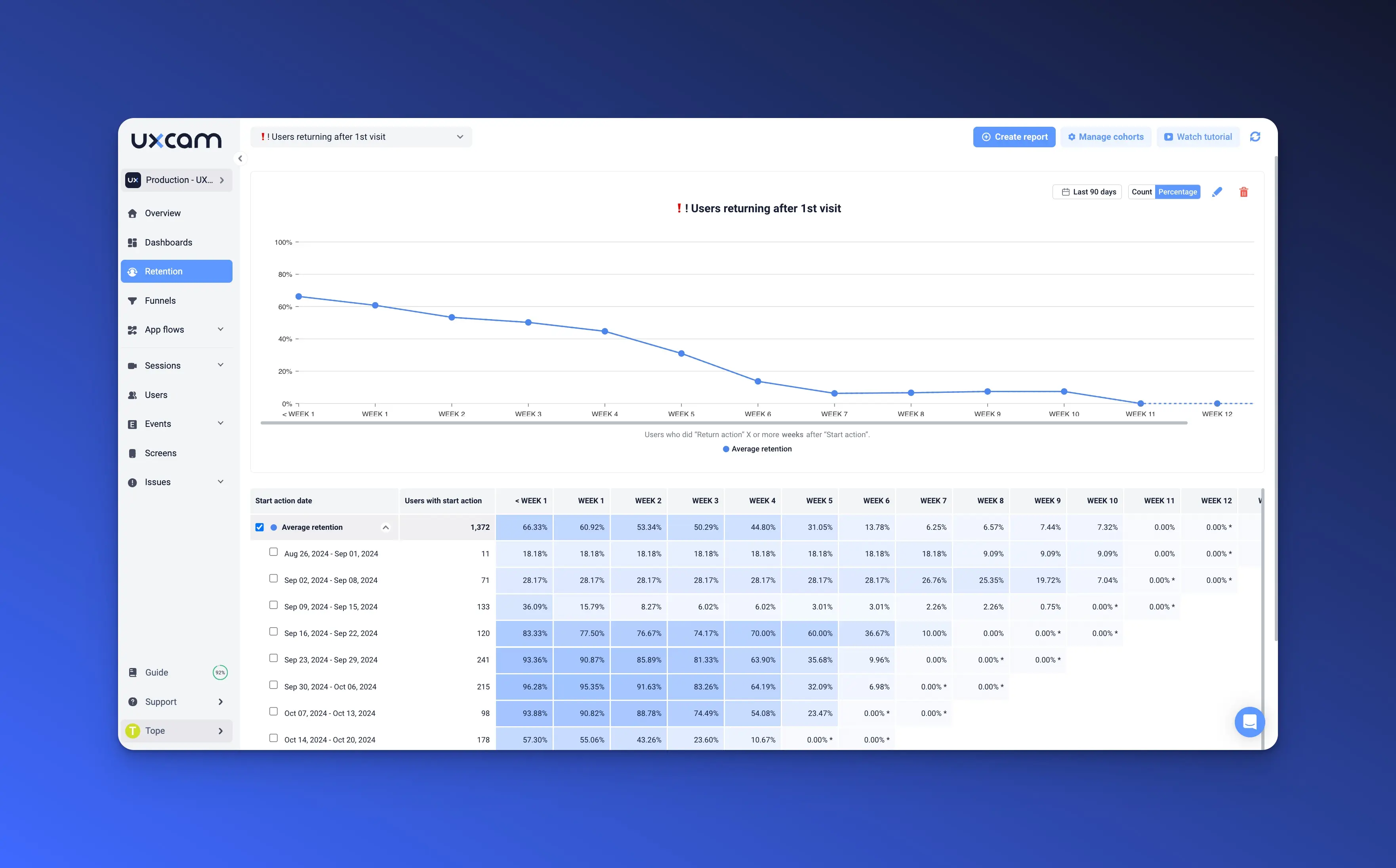
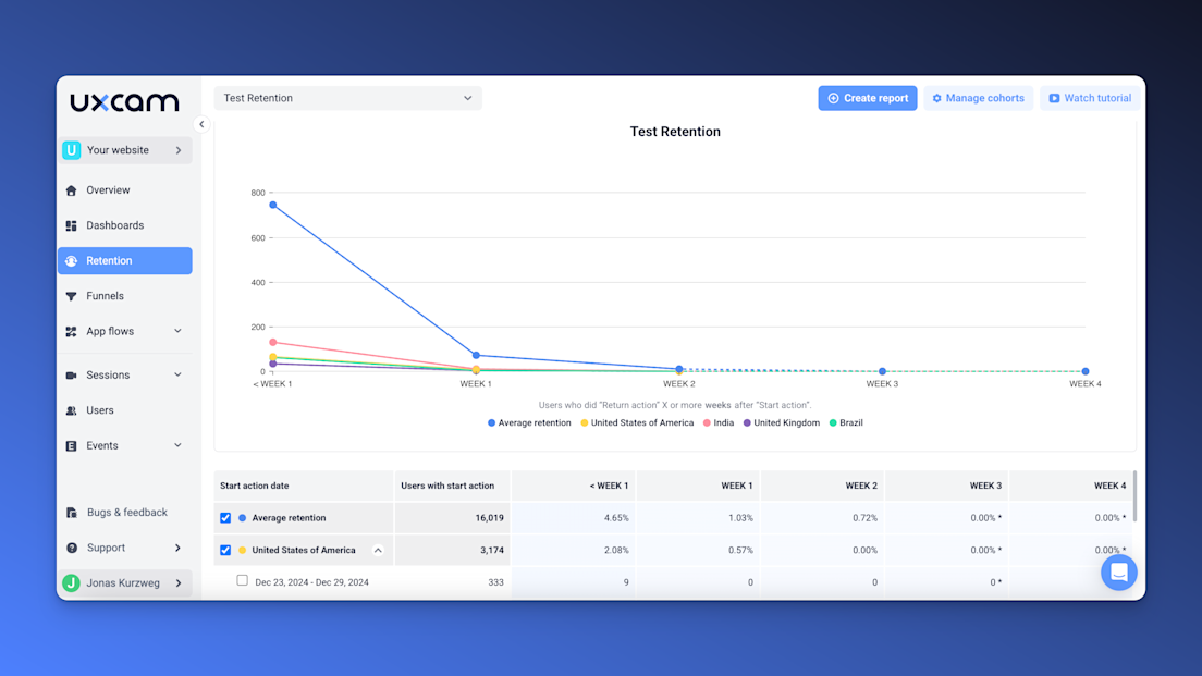
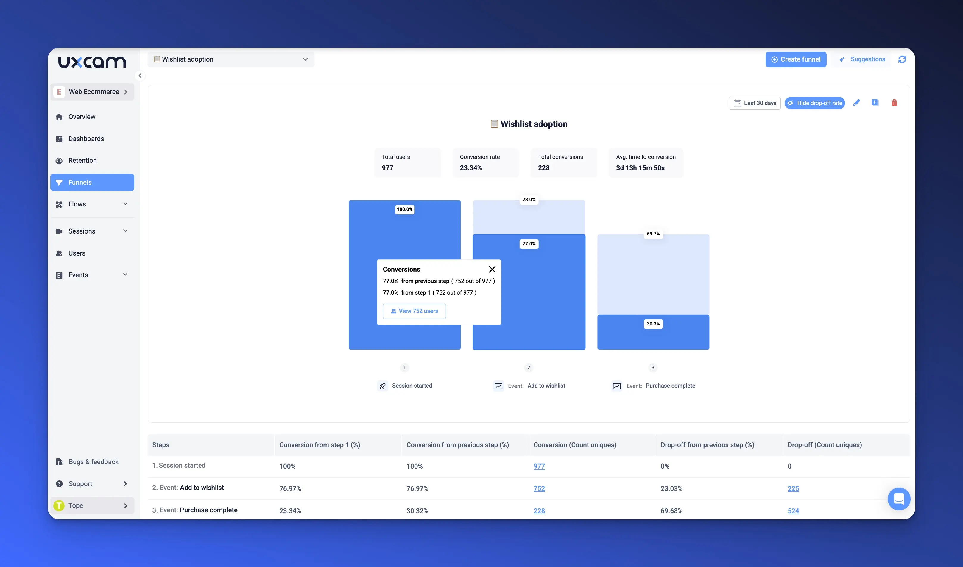
UXCam
UXCam focuses on what users do after they sign up inside your app or product. It’s great for product-led funnels. It will show you user journeys, drop-off points, feature usage, and which actions lead to conversion.


How to use it:
Build a funnel like “Signup → Add a teammate → Create project → Upgrade.”
Compare converted vs churned trial users to find patterns in behavior.
Segment active users by account size or behavior to spot high-fit PQLs.
Best for: Improving trial-to-paid conversion and activation.
Hotjar
Hotjar gives you visual insights into how visitors behave on your site using heatmaps and session recordings. It will show you where users click, how far they scroll, and where they get stuck or leave.
How to use it:
Watch session recordings of users who abandon key pages (like your signup or pricing page).
Use heatmaps to see if users notice your CTA or ignore it.
Add on-page surveys to ask “What’s missing?” or “What stopped you from signing up?”
Best for: Spotting friction on landing pages and signup flows.
HubSpot
HubSpot tracks how leads move through your marketing and sales funnel from first touch to MQL to closed deals. It will tell you about lead source, lifecycle stage, email engagement, lead score, and pipeline stage.
How to use it:
Set clear lifecycle stages (Lead → MQL → SQL) and automate how they move forward.
Score leads based on actions (e.g., 10 points for pricing page, 20 points for webinar).
Create reports to see where leads get stuck—e.g., lots of MQLs but few SQLs.
Best for: Optimizing lead qualification and handoff to sales.
Pendo
Pendo helps you guide trial users or free users to key features through in-app prompts and tracks what they use most. It will show you feature engagement, onboarding completion, and user retention.
How to use it:
Set up onboarding walkthroughs to guide new users to the “aha moment.”
Trigger in-app messages like “Try this next” or “Upgrade now” when users hit key milestones.
Analyze which features your highest-converting users engage with then guide others to do the same.
Best for: Boosting trial activation and freemium-to-paid conversion.
Onsaas
Onsaas helps you compare the best SaaS tools across categories so you can find the right tool for your conversion goals without wasting time. It curates software based on real use cases, ratings, and business types.
How to use it:
Search for tools by use case (like heatmaps or lead scoring).
Compare options side-by-side based on pricing, features, and integrations.
Use filters to find software that fits your growth stage or team size.
Best for: Choosing the right conversion tools without hours of trial-and-error.
Conclusion
Most teams ask, “Where are users dropping off?” But a better question is: What high-intent action do your best users take early, and how can you get more people to do it sooner?
That’s where real conversion growth happens, not at the end of the funnel, but right after the first click.
Now that you know what “good” looks like and how to spot weak points, it’s time to act on what matters most. If you want to see exactly how users move, hesitate, or succeed inside your product UXCam helps you turn that behavior into faster activation and smarter product decisions. Try UXCam for free today.
You might also be interested in these;
How To Collect User Feedback for SaaS & Best Tools
SaaS Metrics Dashboard Examples and When to Use Them
Top 14 SaaS Product Usage Metrics and How to Improve Them
SaaS Customer Journey Mapping - A Comprehensive Guide
Top 11 SaaS Analytics Tools and Software
How to do Website Usability Testing
Website UX Audit - Steps, Checklist and Best Tools
How to Track User Activity on Website - Guide for Product Teams
AUTHOR
Burkhard Berger
Burkhard Berger is the founder of Novum™. He helps innovative B2B companies implement revenue-driven SEO strategies to scale their organic traffic.
What’s UXCam?
Related articles


Website Analysis
Website Analysis - The Ultimate Guide 2025
Website analysis guide: Discover actionable tips to analyze and optimize your site for peak efficiency and user satisfaction. Ready to elevate your web...


Jonas Kurzweg
Growth Lead


Website Analysis
How to Find Unique Monthly Visitors For a Website
Learn how to find unique monthly visitors for a website, track them accurately, and turn that data into product strategy using GA4, server logs, and...


Tope Longe
Growth Marketing Manager


Website Analysis
SaaS Customer Journey Mapping - A Comprehensive Guide
Learn how to map every stage of the SaaS customer journey, from acquisition to advocacy, and discover proven tactics to engage and retain loyal...