12 Actionable Strategies to Improve Website Engagement


Improving website engagement is about designing experiences that lead users to explore, interact, and convert on their terms.
You’ve likely already fixed the obvious friction points. But the difference between good and great engagement lives in the details most teams overlook.
Here’s the kicker: The average bounce rate across industries sits between 41%–55%, and most sessions last less than a minute. That’s not much time to earn trust, show value, or drive action.
This article breaks down 12 advanced, actionable strategies to help you move past surface-level metrics and actually optimize engagement using website analytics metrics, behavioral insights, and product-led thinking.
Let’s break down exactly how to improve your website engagement, through the lens of what your users do, not just what they see.
Summary - How to improve website engagement
Here's a quick summary of the strategies to increase user engagement on your website.
| Strategy | Description |
|---|---|
| Use behavior-based website analytics | Go beyond bounce rate and session duration. Use metrics like rage clicks, scroll |
| Optimize the first 5 seconds | Users decide to stay or bounce in 5 seconds. Improve page load time, |
| Identify and remove friction points | Use UXCam to analyze funnel drop-offs and spot friction through session replays, failed |
| Improve engagement with micro-conversion | Track actions like quiz starts or guide downloads using custom events in UXCam. |
| Personalize content based on behavioral segments | Segment users by behavior—mobile vs desktop, rage-clickers, or scrollers—and personalize content blocks or |
| Implement UX-driven feedback loops | Pair surveys (e.g. Survicate) with session replays to validate feedback. Watch how users |
| Create engagement goals and track progress | Define KPIs like session depth or flow success. Use UXCam dashboards to visualize |
| Use event-driven engagement triggers | Set custom events (e.g. user pausing on a pricing page) to trigger chats |
| A/B test your way to better engagement | Use behavior data from UXCam to prioritize tests. Improve headlines, CTAs, or forms |
| Optimize for mobile web experience | Mobile-first is a must. Optimize for thumb-friendly UI, faster load, and vertical flow. |
| Leverage scroll-triggered interactions | Use scroll-depth analytics to trigger modals, CTAs, or prompts at key points. UXCam |
| Create a unified view across web + mobile analytics | Track the full user journey across app and web with UXCam. |
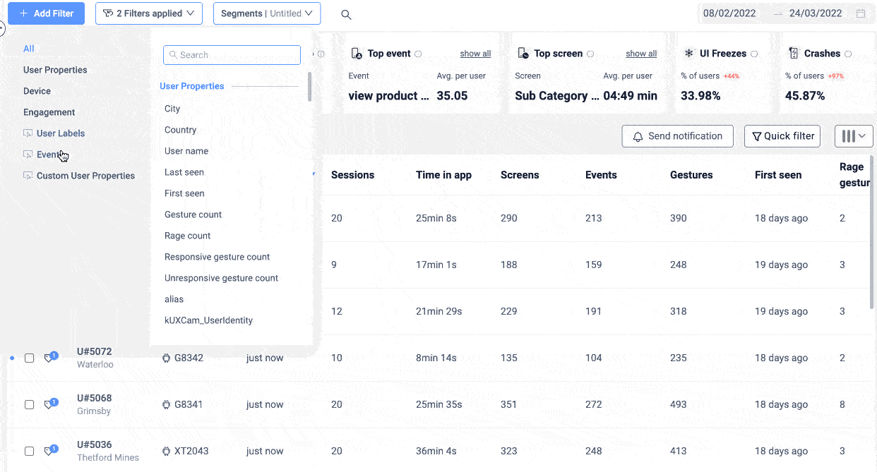
Use behavior-based website analytics
If you're still relying on surface-level metrics like bounce rate or pageviews to measure engagement, you're only seeing a sliver of the real story.
Website analytics metrics should tell you more than how many people showed up, they should show you what those users did, where they got stuck, and why they left.
Start with the basics:
Bounce rate tells you who didn’t bother exploring.
Session duration hints at time spent, but not the quality of that time.
Click-through rate (CTR) measures intent.
Scroll depth shows if users are consuming your content.
Rage clicks? Those signal frustration.
Exit rate reveals where interest fades.
These are helpful, but only when viewed in context. The problem? Traditional analytics tools show you what happened, but not why it happened.
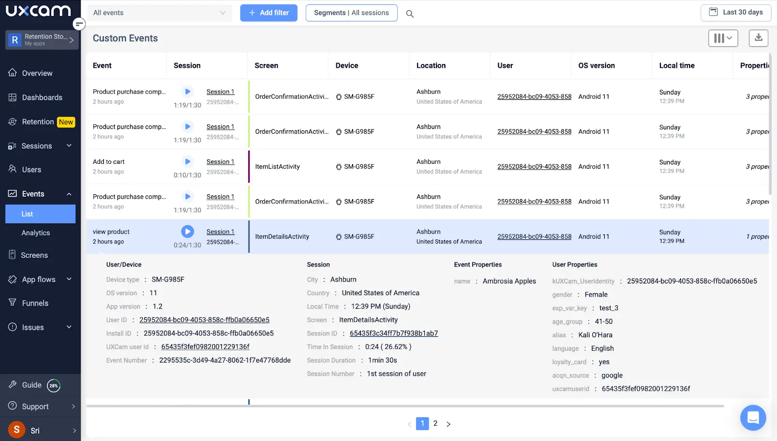
That’s where UXCam come in. With session replays and autocapture, you don’t just track events, you watch the user journey unfold. You see the taps, the hesitations, the swipes, and the pain points your dashboard can’t explain.


Here’s what we’ve learned over the years: Behavior beats assumptions. You can’t build the right experience if you’re optimizing for averages. You need to know how different users engage based on their intent.
Always segment your analytics by user intent and traffic source. A user arriving via a blog post behaves very differently from one who clicked through a retargeting ad. Without that lens, you risk building for the wrong audience.
The goal isn’t more data. It’s smarter decisions. Let behavior show you the way.
Optimize the first 5 seconds
Here’s the truth no one likes to admit: most users decide whether to stay or bounce within the first 5 seconds of landing on your site.
That’s all you get. Five seconds to show you’re relevant, trustworthy, and worth sticking around for.
If your bounce rate is high or your time on page is low, don’t overthink it. Start by looking at that crucial first impression. What loads first? Where is the eye drawn? Is your call-to-action (CTA) instantly clear?
Over the years, we’ve seen three factors consistently make or break engagement:
Page load speed — A slow page is a silent killer. Even a one-second delay can tank conversions.
Visual hierarchy — If everything looks equally important, nothing stands out. Guide the eye.
Clarity of message — Don’t be clever. Be clear. State your value prop upfront.
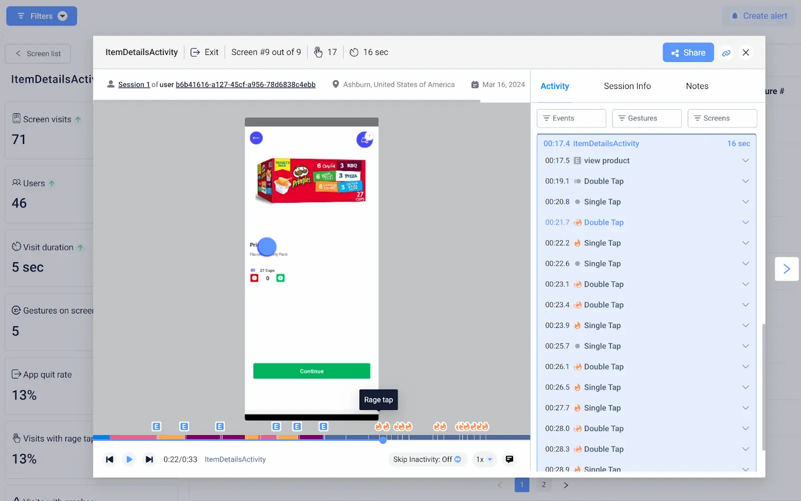
This isn’t guesswork. Use heatmaps and session replays to see exactly how users interact. With UXCam, you can track screen interactions, see where users tap or hesitate, and spot what’s distracting them.


Watch where attention drops off. If users scroll just 20% down your page before exiting, your best content might be buried too deep.
In those first 5 seconds, every pixel matters. Make them count.
Identify and remove friction points
Friction isn’t always obvious. It’s not only broken buttons or slow loaders, it’s anything that makes your user pause, backtrack, or give up.
So many product teams have had to learn this the hard way: Users won’t tell you what’s wrong. They’ll just leave.
So, how do you spot friction?
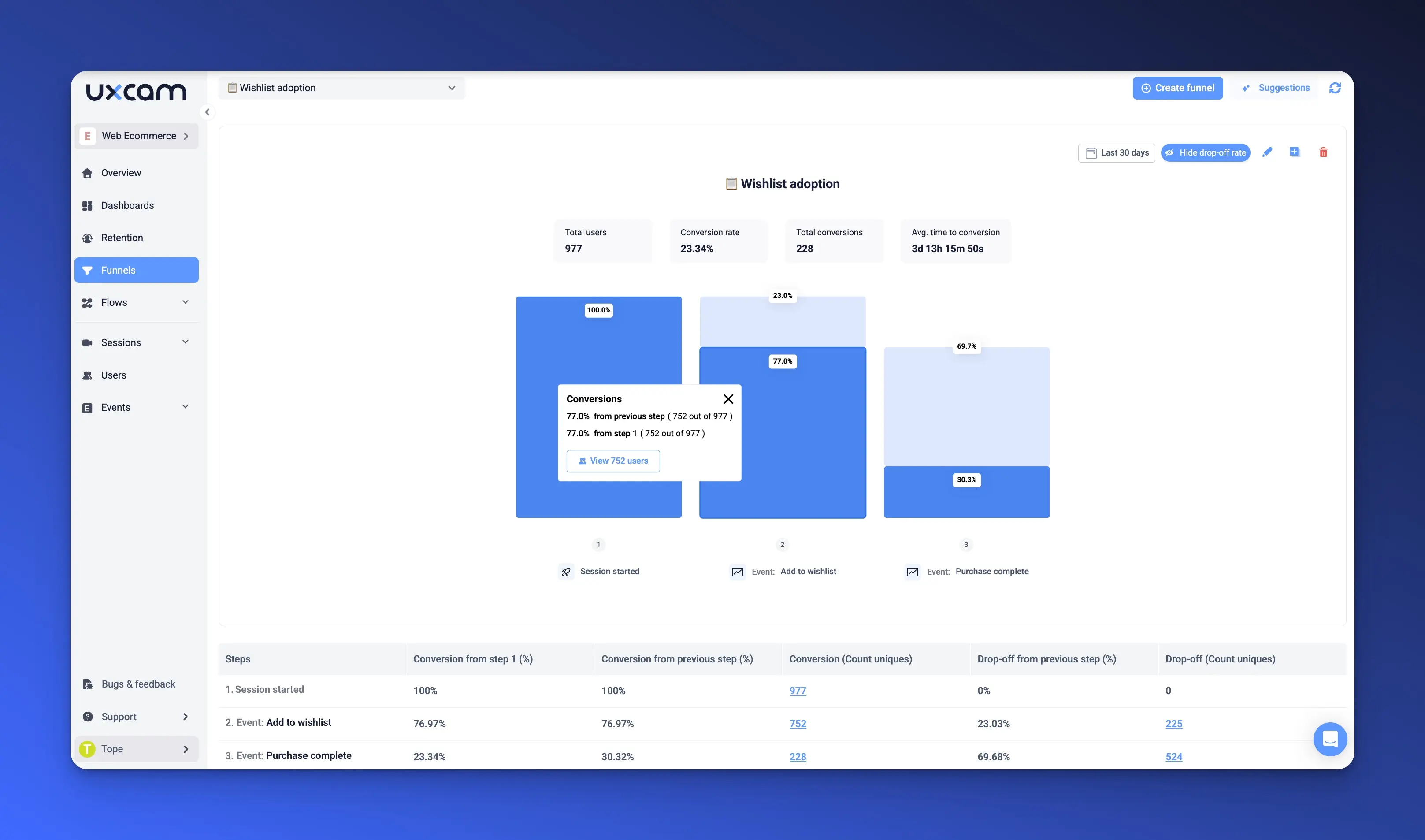
Start with your conversion funnels. Where do users drop off? Is it after step two of onboarding? Just before checkout? Use UXCam to zoom into these exact sessions and watch what users saw in real time. With just one click from your dashboard, you jump right into watching session recordings.


Then dig deeper:
Interaction hotspots show where people are engaging—and where they aren’t.
Failed clicks highlight UI elements that look tappable but aren’t.
Backtracking behaviors (like jumping between pages or re-entering the same field) often signal confusion.
The trick is to combine quantitative data (drop-off rates, page exits, funnel depth) with qualitative insight from session replays. You’re not just tracking behavior—you’re understanding intent.
And here’s the kicker: even small friction adds up. One awkward form field or unclear button can wreck your entire flow.
When you remove that friction, the payoff is huge. Engagement rises, conversions improve, and your users move smoothly through the experience you designed.
Improve engagement with micro-conversion
Not every win has to be a big one. Sometimes the smallest interactions are what keep users engaged and coming back.
These are your micro-conversions, those meaningful steps users take that signal interest, intent, or momentum. They might not be the final goal, but they lead users closer to it.
Think about:
Clicking through an image gallery
Starting a quiz
Watching a product demo
Downloading a guide
Saving a feature to favorites
These actions matter. They build commitment, especially in longer or more complex journeys.
The key is to identify, track, and optimize these touchpoints. With a tool like UXCam, you can set up custom events to capture micro-conversions. Then monitor how often they’re triggered, by whom, and in what context.


You should also track CTA engagement, click-through rate, and scroll reach to understand how far users are going before acting. If they’re consistently dropping off before hitting your micro-CTA, it’s a sign the value isn’t clear—or the UI isn’t doing its job.
Here’s a tip from experience: treat micro-conversions like stepping stones. Each one builds trust and nudges the user forward.
And when you optimize for those small wins, the big wins tend to follow.
Personalize content based on behavioral segments
If you want to improve website engagement, you need to stop treating all users the same.
Your audience isn’t one-size-fits-all. A returning visitor who rage-clicked through a buggy checkout flow last week doesn’t need the same experience as a first-time visitor browsing your homepage on mobile.
Here’s where behavioral segmentation comes in. You can, and should tailor your site experience based on what users actually do, not just who they are.
Segment by behavior:
Are they on mobile or desktop?
Did they scroll halfway through your pricing page but never convert?
Are they bouncing after multiple rage clicks?
With UXCam, you can surface these patterns and group users by real interactions. Once you’ve got your segments, you can start delivering personalized content, like a sticky banner for hesitant users, or a modal with a time-sensitive offer for returning visitors.


Want to go further? A/B test personalized elements to see which variation drives better engagement. Maybe your mobile users respond better to a floating CTA, while desktop visitors prefer inline prompts.
Here’s my rule of thumb: personalization should feel helpful, not creepy. When you meet users where they are—based on what they’ve actually done—you reduce friction and boost conversion naturally.
In my experience, the highest-engagement websites don’t just talk at users. They respond to them.
Implement UX-driven feedback loops
You can guess what users think—or you can just ask them. But here’s the catch: raw survey data on its own can be misleading.
That’s why the best feedback loops combine qualitative analytics with real-time behavioral context.
Start by embedding lightweight survey tools like Survicate to ask simple questions at the right moments. For example, after a failed search or an abandoned form, ask: “Was something missing?” or “What stopped you from completing this step?”
But don’t stop there.
Pair that feedback with a UXCam session replay from the same user. Did they struggle to tap a CTA? Did the page flicker or break during scroll? Often, what they say and what they do are two sides of the same coin—and you need both to really understand the full picture.
Here’s an example from own team: we saw repeated feedback about “confusing pricing.” But when we reviewed session replays, we realized users weren’t reading the full plan comparison, they were skimming and missing key features. We changed the layout, and engagement went up 28%.
Pro tip: Create a habit of weekly “friction reviews” where your product and UX teams watch key session replays and correlate them with user feedback.
User feedback is only powerful when it leads to change. When you build that into your product workflow, engagement improves not just once—but continuously.
Create engagement goals and track progress
You can’t improve what you don’t measure. And when it comes to website engagement, you need more than just a dashboard full of metrics, you need clear goals tied to real user behavior.
Start by defining what engagement means for your product. Is it time spent on key pages? Is it completing a tutorial? Clicking on your core CTA?
Once you’re clear on that, track the right KPIs:
Session depth – how far users go within your site
Engagement rate – frequency and quality of interactions
Conversion flow success – how smoothly users complete high-value actions
This isn’t just for reporting. It’s how you create focus.
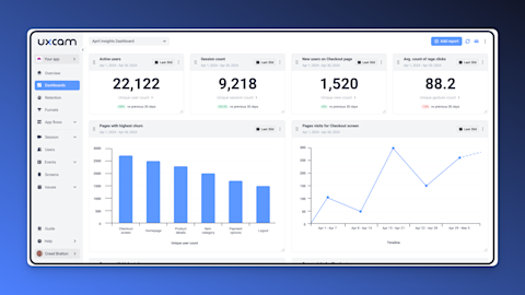
Use UXCam to build dashboards that show weekly trends, so your team sees what’s improving, what’s plateauing, and where to dig deeper. These aren’t vanity metrics—they’re conversation starters.


Now, take it a step further: tie your engagement goals directly into your team’s OKRs. If one of your objectives is to improve trial-to-paid conversion, define engagement targets that move that needle.
Engagement isn’t an outcome, it’s a leading indicator. Track it with purpose, and you’ll start seeing the downstream impact on retention, revenue, and product stickiness.
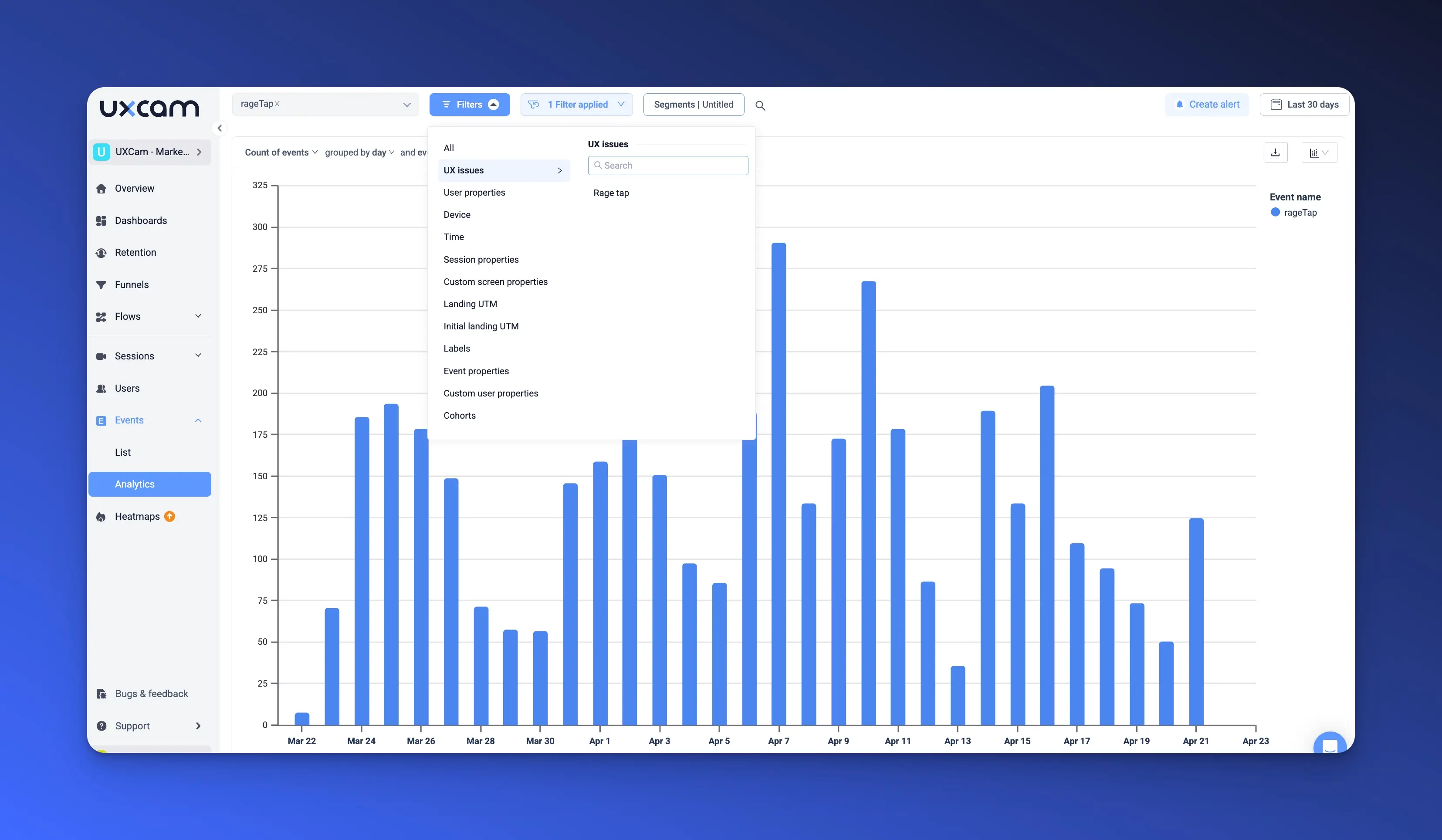
Use event-driven engagement triggers
Sometimes, the best way to boost engagement is to act at the right moment and not just the right place.
That’s where event-driven engagement triggers come in.
Imagine a user hesitating for 15 seconds on your pricing page. That’s a signal. Instead of letting them bounce, you trigger a support chat that asks, “Need help picking the right plan?”
It’s a small moment, but it changes the experience from passive to proactive.
You can do this with behavior data from UXCam, which let you tag specific user interactions, scrolling, hovering, clicking, or pausing and create custom events around those behaviors.
Here are some ideas for you:
Show a “Need help?” prompt after a user fails to click a button more than once
Trigger a product tour if someone returns to the same page three times in a week
Launch a discount banner if a user scrolls through the entire features page without converting
These are event-based analytics in action. You're not just tracking behavior, you’re responding to it in real time.
Start small. Pick one high-intent page and test one trigger. Measure how it impacts time on page, CTA engagement, and bounce rate.
The best user experiences feel timely, personal, and helpful. When you build event-driven triggers into your product, you meet users in the moment and that’s when real engagement happens.
A/B test your way to better engagement
If you're not A/B testing regularly, you're leaving engagement on the table.
We've seen it too often, teams assume they know what works based on gut feeling or stakeholder opinion. But the truth is, what you think will work and what actually resonates with users are often two different things.
That’s where A/B testing earns its place. Whether it's a headline, CTA, page layout, or even the length of a form, every element on your site is testable. And each small improvement adds up to real gains in website engagement metrics like time on page, click-through rate, and conversion flow success.
Here’s where it gets powerful: don’t just test randomly. Use UXCam to uncover actual user friction, see where people rage-click, scroll past key content, or hesitate. Let that behavior data guide your testing roadmap.


For example, if you notice users constantly hovering near a CTA but not clicking, test variations on button copy or placement. If users abandon a long form midway through, try breaking it into two steps and see what changes.
This is the core of CRO (conversion rate optimization) and the best part? It’s all measurable. With the right tools, you’ll not only see which variant wins, but why it worked better.
Run smaller tests continuously. Big wins often come from small, iterative improvements, not one massive redesign.
Optimize for mobile web experience
Let’s be real, if your mobile web experience isn’t seamless, you’re falling behind.
Mobile traffic isn’t a trend anymore, it’s the default. And yet, I still see desktop-first designs squeezed onto tiny screens, with tap targets that frustrate and layouts that overwhelm.
Here’s what we’ve learned: users will tolerate a less-than-perfect desktop experience. But on mobile? They bounce fast. That’s why mobile UX is critical to improve engagement metrics like scroll depth, tap-through rate, and session duration.
Some quick wins:
Make your tap targets large enough for thumbs—not just cursors
Optimize page load time (especially on slower connections)
Use clear screen hierarchy, stack content vertically and reduce cognitive load
Now here’s the pro move: use UXCam’s mobile session replays to watch real users navigating your site on their phones. You’ll see where they pinch-zoom, mis-tap, or drop off altogether. These sessions will surface issues your test device or staging environment never reveals.


You don’t need to guess how your mobile users feel, you just need to watch.
Pro tip: Treat mobile as its own product experience, not just a responsive version of your desktop site. Design for context, intent, and attention span.
Mobile isn’t second-screen anymore. For many users, it’s the only screen. Build like it.
Leverage scroll-triggered interactions
You already know users don’t read—they scan. But what many teams overlook is how far users actually scroll before losing interest.
That’s why scroll depth analytics is such a valuable signal. It tells you how much of your content gets seen—and where users are dropping off.
Here's the trick: don’t just track scroll depth—act on it.
Let’s say most users hit 50% of your pricing page and start bailing. That’s your cue to surface a CTA, launch a support prompt, or suggest a case study—right at that scroll point.
This is called progressive engagement. You’re not blasting users with everything up front. You’re pacing the experience, revealing the right message at the right time.
Tools like UXCam help you see these patterns clearly with scroll maps and heatmaps. You’ll spot where engagement drops, and where users get stuck or hesitate.
Pro tip: Don’t overdo it. The goal isn’t to interrupt—it’s to guide. Scroll-triggered interactions should feel natural, like a nudge, not a push.
When done right, this tactic can lift click-through rates, increase time on page, and move users deeper into your funnel—without changing the page layout at all.
Create a unified view across web + mobile analytics
Here’s a challenge we’ve seen in every product-led org: the user journey doesn’t live in one place, so why does your data?
For SaaS and mobile-first companies, users bounce between your website and app constantly. A visitor might sign up on the web, explore features on mobile, and upgrade back on desktop.
But if your analytics are siloed, you miss the big picture.
That’s why you need a robust analytics solution, a single lens to see how users move across touchpoints.


UXCam solves this beautifully. It tracks both mobile and web sessions in one platform, giving you full-funnel visibility. You can see how a user started on your marketing site, what screens they visited in the app, and where they dropped off or got stuck, without switching tools or stitching data manually.


This unified view is critical for:
Identifying friction across channels
Personalizing experiences based on past behavior
Aligning product, marketing, and support teams around a shared user story
Map out your end-to-end user journey across both platforms. Then use product analytics from UXCam to diagnose gaps, inconsistencies, or engagement cliffs.
If you want to improve engagement, you need to understand it holistically. Don’t settle for partial visibility—track the entire experience.
Conclusion
Improving website engagement isn’t about gut feeling or throwing ideas at the wall. It’s about building a system, measuring what matters, learning how users behave, and making intentional changes based on real insights.
You don’t need a full redesign to move the needle. You need focus. Start with your key metrics, layer in behavioral context, and iterate quickly. The faster you test, learn, and optimize, the faster you’ll see results.
And remember, behind every data point is a human trying to get something done. Your job is to make that journey as smooth and valuable as possible.
Want to see what your users are doing beyond the numbers? Try UXCam for free.
FAQs
Website Engagement FAQs
What is website engagement?
Website engagement refers to how users interact with your site—measured through actions like clicks, scrolls, time on page, and conversions. High engagement means users find your content useful and are more likely to convert or return.
What is a good website bounce rate?
A good website bounce rate typically ranges between 26% and 40%. Rates above 55% may indicate poor content relevance, slow load times, or user experience issues that should be addressed.
How to increase user engagement on websites?
To increase user engagement on websites, use behavior-based analytics, optimize for mobile, reduce page load times, personalize content, and implement A/B testing. Tools like UXCam can help you understand user behavior through session replays and interaction tracking.
You might also be interested in;
Web Analytics Strategy - How to Improve Your Product with Data
What is a Website Conversion? & 16 Strategies to Improve It
How to Convert Website Visitors into Customers
Website Click Tracking - Best Tools & Methods Explained
AUTHOR
Tope Longe
Product Analytics Expert
Ardent technophile exploring the world of mobile app product management at UXCam.


Related articles


Website Optimization
10 Best Landing Page Optimization Tools
Boost conversions with the 10 best landing page optimization tools. Compare features, pricing, and use cases for growth-focused...
Tope Longe
Product Analytics Expert


Website Optimization
10 Proven Web Analytics Best Practices for Product Teams
Discover 10 proven website analytics best practices to boost product performance, improve user insights, and drive growth—plus a free UXCam Web...
Tope Longe
Product Analytics Expert
Website Optimization
12 Actionable Strategies to Improve Website Engagement
Boost user engagement with 12 proven strategies. Learn how to use website analytics, session replays, and behavior insights to improve conversions and...
Tope Longe
Product Analytics Expert