

If you're building a product, you're designing an experience, whether you mean to or not. And that experience? It’s what defines how users feel, act, and ultimately, whether they stay or churn.
UX design best practices isn’t just for designers. They’re your toolkit as a product manager to improve usability, drive adoption, and boost user satisfaction, without the guesswork.
According to Forrester, every dollar invested in UX brings $100 in return. That’s a serious user experience ROI. It’s goes beyond aesthetics, it’s a growth lever.
When UX works, conversions go up, complaints go down, and retention climbs. This is customer-centric design in action. And it pays off.
In this guide, we’re going deeper than surface-level UX. You already understand the basics—now let’s explore the proven, practical practices that will help you lead better decisions, ship stronger products, and create experiences your users actually want to come back to.
Top UX design best practices at a glance
| Best practice | Actionable tip | How UXCam helps |
|---|---|---|
| Start with continuous user research | Schedule monthly interviews; review support tickets weekly | Use session replays to validate real frustrations |
| Map end-to-end user journeys | Build flowcharts to highlight friction | Path Analysis reveals drop-offs automatically |
| Bake in usability & accessibility | Use WCAG 2.2 + test with 5 real users | Filter sessions by assistive tech to test accessibility |
| Design for clarity, reduce cognitive load | Apply Hick’s Law; avoid decision fatigue | Heatmaps surface design distractions |
| Accelerate onboarding & time-to-value | Ensure users reach value in under 2 minutes | Use Funnels to measure first-key-action timing |
| Craft thoughtful micro-interactions | Inline feedback, progress animations | Replay taps to improve microcopy & gestures |
| Adopt a consistent design system | Audit screens for UI parity | Tag screens to spot component inconsistencies |
| Prototype, test, iterate fast | Validate early with low-fi tests | Use Event analytics to compare prototype success |
| Monitor real-world performance | Track crash rate, load time, CLS | Autocaptured performance + video = full context |
| Eliminate dark patterns, build trust | Avoid deceptive modals; add transparent choices | Replays show if users feel trapped or misled |
What are UX design best practices?
UX design best practices are proven guidelines that improve usability, accessibility, and delight across the entire product lifecycle.
They’re not guesses. They’re not trendy UI patterns from Dribbble. These are time-tested principles, like reducing cognitive load, ensuring visual hierarchy, or designing for accessibility, that help you make better product decisions faster.
Think about it like this: when you shorten your onboarding from 7 steps to 3, and guide users with smart microcopy and visual cues, you're not just being clever, you’re applying usability guidelines and interaction design principles. And your metrics will thank you.
The difference between best practices and trends is that best practices scale. They work across teams, across platforms, and most importantly, across users with different needs.
As a product manager, your job isn’t to guess what looks good. It’s to build what works. That’s where UX heuristics come in, think of them as the operating system behind every great experience.
You don’t need to reinvent UX. You only need to get really good at the fundamentals.
Why product managers should champion UX outcomes
There was a time when UX was seen as the designer’s territory, wireframes, color palettes, button styles. You’d hand off a spec, they’d make it “look good,” and you’d move on. But that time is long gone.
Today, great UX about how a product looks and also how it works. How fast users reach value. How easily they move through a flow. How confident they feel using your product. That’s product strategy, not just design. And that means it’s your responsibility too.
As a product manager, you’re uniquely positioned to connect the dots. You define the problems. You shape the roadmap. You decide what gets prioritized and how it's measured. So if the user experience falls short, it’s not only a design issue. It’s a product issue.
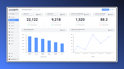
Here’s what we’ve learned: every business metric has a UX layer.
Activation rate? Pair it with time-to-value.
Retention? Look at task success rate.
Conversion? Consider form abandonment or rage clicks.
Pro tip: Start adding UX metrics to your dashboards. You’ll start seeing why your KPIs move, or stall. And more importantly, you’ll be able to do something about it.


When you take ownership of UX outcomes, you stop building features… and start building experiences that grow the business. That’s what separates good PMs from great ones.
UX best practices for product team
Start with continuous user research
Map end-to-end user journeys
Bake in usability & accessibility
Design for clarity and low cognitive load
Accelerate onboarding & time-to-value
Craft thoughtful micro-interactions
Adopt a consistent design system
Prototype, test, and iterate fast
Monitor real-world performance
Eliminate dark patterns and build trust
1. Start with continuous user research
If you want to build something users actually want, you have to watch what they do, and listen to what they say.
That sounds obvious, but in practice, most teams treat user research like a checkbox during discovery or onboarding. Then they move on, assuming they've got it figured out. You can't afford to do that.
Why? Because products live and breathe. The moment you ship a new feature or tweak a flow, your user experience changes. What worked last quarter might be a friction point today. And the only way to catch it early is to stay close to the people using your product every day.
That’s why we always recommend this simple rhythm: Talk to at least 2 users every month. Doesn’t have to be a formal usability lab. A 30-minute call with a power user and a churned user will teach you more than any dashboard. And if you don’t have time for calls? Review support tickets weekly. Your users are already telling you what’s broken, they just use different words. Pattern-match what you hear, then investigate further.
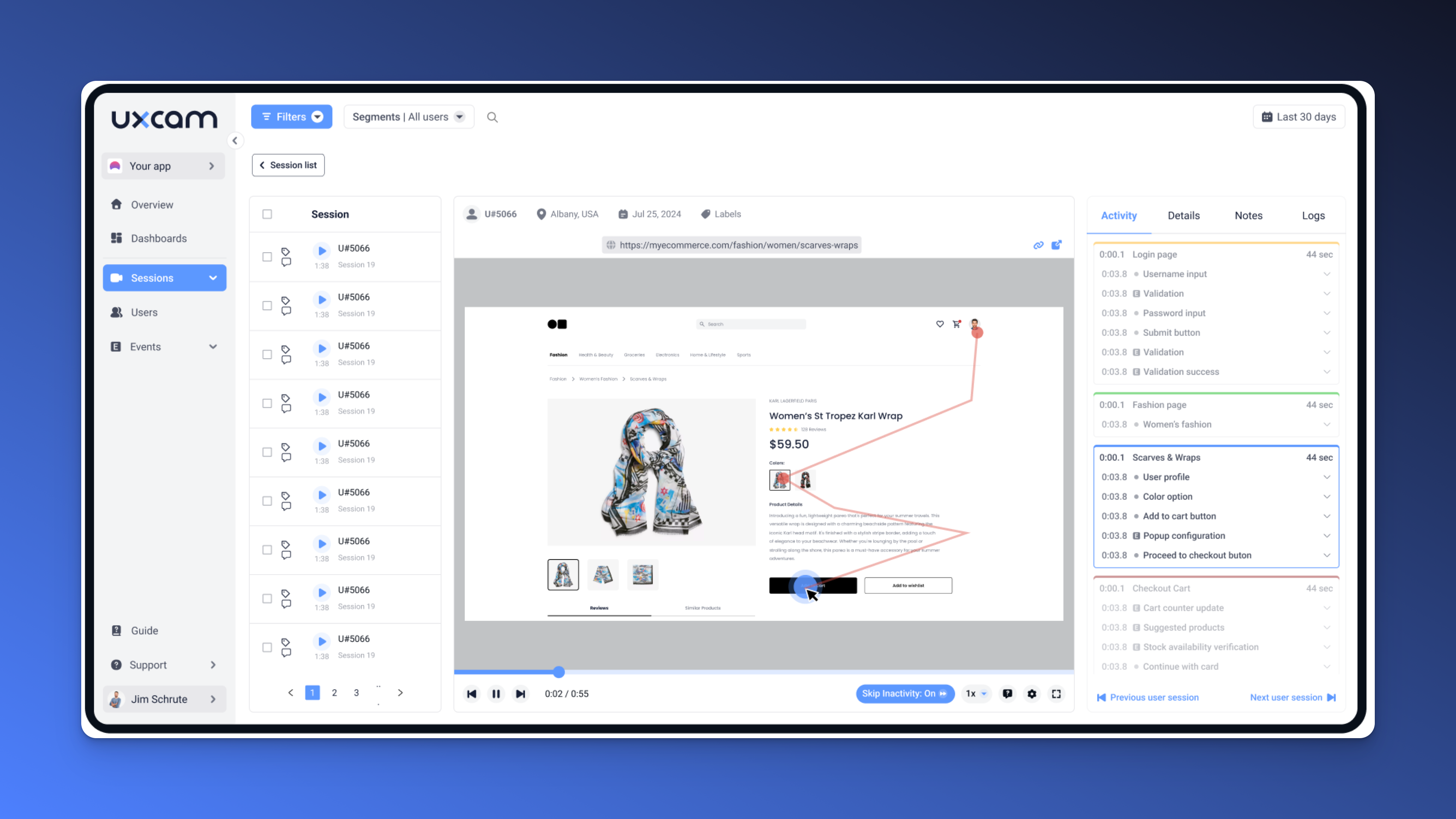
But here’s where it gets powerful: Use session replays to actually see what users do. Because what people say and what they do? Totally different things. You might hear “it’s buggy” in a ticket—but a replay shows the user hunting for a button, backtracking three times, and rage-clicking out of frustration. That’s gold.


With a tool like UXCam, you can replay real sessions to spot confusion, hesitation, and drop-offs. It’s like watching hundreds of user tests without having to schedule a single one. You’ll uncover issues your team didn’t even know existed.
The best PMs rely on data or interviews. They combine both to form a complete picture of the user experience, then prioritize ruthlessly. That’s how you build a product people stick with.
2. Map end-to-end user journeys
If you don’t know how users move through your product, how can you expect to improve their experience?
One of the biggest mistakes we see PMs make is optimizing screens in isolation, like fixing a broken signup page without realizing it’s the fifth barrier in a longer, broken flow. You can't fix what you can't see, and that’s why journey mapping is so powerful.


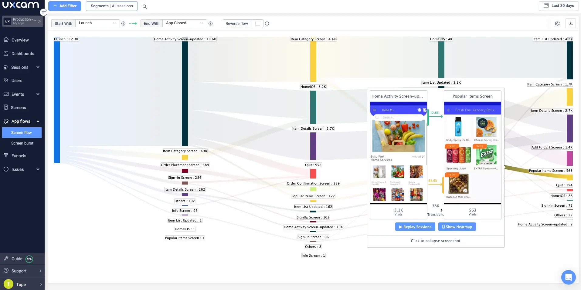
Start by sketching out your ideal user journey, step by step. Then compare it to what’s really happening. Where do users drop off? Where do they loop back? Where do they give up?
You don’t need a fancy design tool. Even a whiteboard or FigJam is enough. What matters is visualizing the full experience, from first touch to activation, conversion, and even support interactions.
Action tip: Look for steps that are too long, too complex, or just unnecessary. Then flag those as high-friction zones.
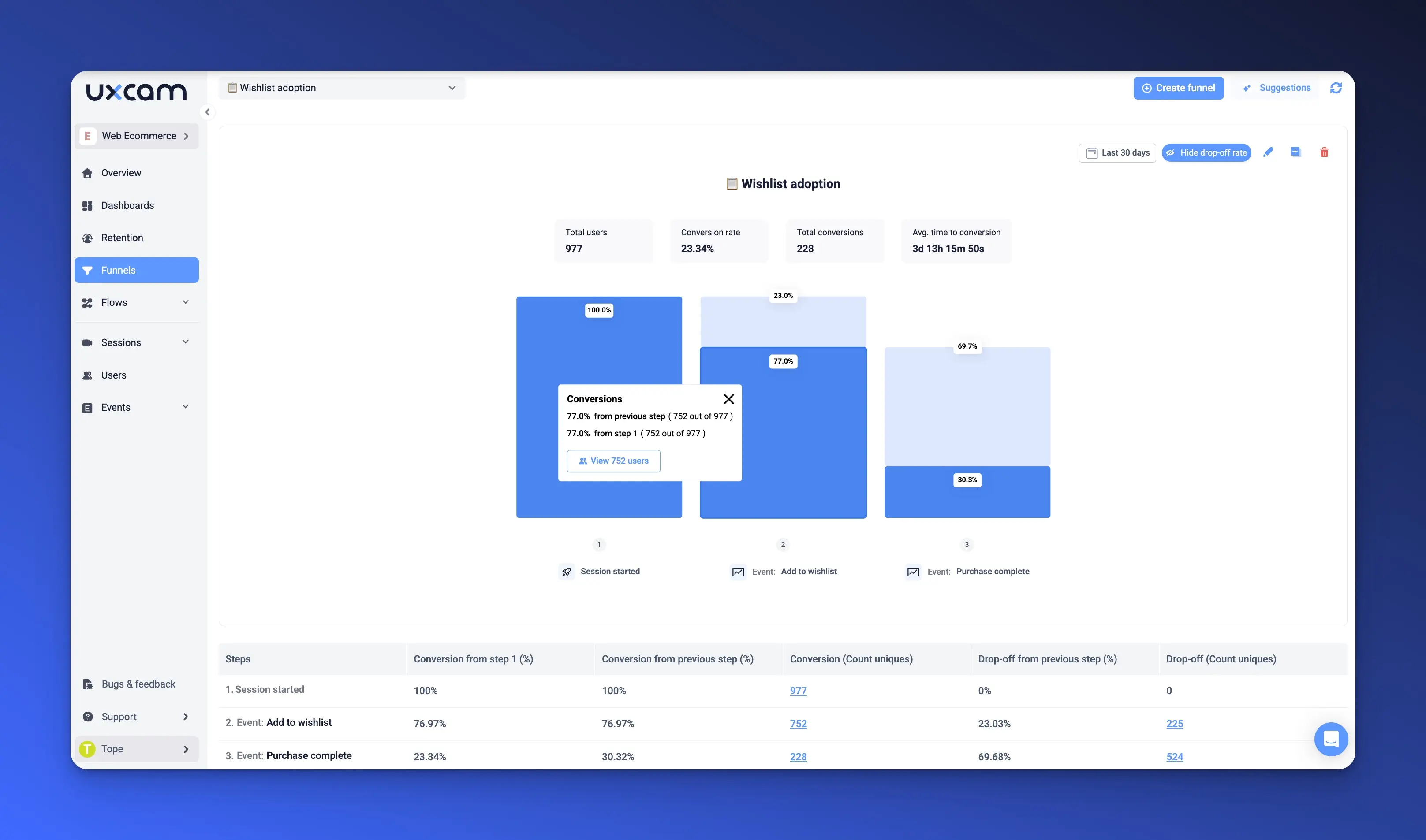
Here’s where UXCam helps. With Path Analysis, you can see the actual flows users take, across devices, versions, and sessions. You’ll spot unexpected loops, exits before onboarding, or users skipping your CTA entirely. And once you see that pattern, fixing it becomes a matter of prioritization, not speculation.
As a PM, your have a responsibility to to ship features and build journeys that make sense. Start with visibility. Everything else follows.
3. Bake in usability & accessibility
Let me be blunt: if your product isn’t usable by everyone, it’s not usable enough.
Usability is the bedrock of a good experience. That means fewer taps, clearer copy, faster feedback, and most importantly, accessible to all users, regardless of ability, device, or context.
Here’s the kicker: accessibility isn’t checking boxes for WCAG compliance. It’s about empathy. Ask yourself: could a new user complete this flow with one hand? On a slow connection? With a screen reader?
Action tip: Start small. Run every new flow by 5 real users. Not teammates, actual users. You’ll be amazed what they point out. And for accessibility, follow WCAG 2.2 standards as your baseline, then build empathy on top of it.
Now, how do you scale this without slowing down? Use UXCam to filter sessions by accessibility features, like font scaling or screen reader usage. You’ll be able to identify which experiences break down for users with specific needs—without waiting for a support ticket or a bad review.
The best product teams don’t just aim for “usable.” They aim for "effortless", for everyone. If you build with accessibility in mind from day one, you won’t have to retrofit it later. And best believe, your users and your metrics will reflect that.
4. Design for clarity and low cognitive load
Let me put it simply: your users are busy, distracted, and using your product with half a dozen other things competing for their attention.
So when your interface feels cluttered, when decisions take too long, or when steps aren’t intuitive—you lose them. Not because they don’t care, but because the experience demanded too much mental effort. That’s what we call cognitive load, and it’s a silent killer of adoption.
Your goal is clarity. Not just pretty UI, but intuitive flow. Remove unnecessary elements, group related actions, and break complex tasks into manageable steps. Every tap, field, or modal should justify its existence.
Here’s a trick I’ve used for years: apply Hick’s Law. The more choices you give, the longer it takes someone to decide. Limit choices. Default where possible. And guide users with visual cues, progressive disclosure, and clear next steps.
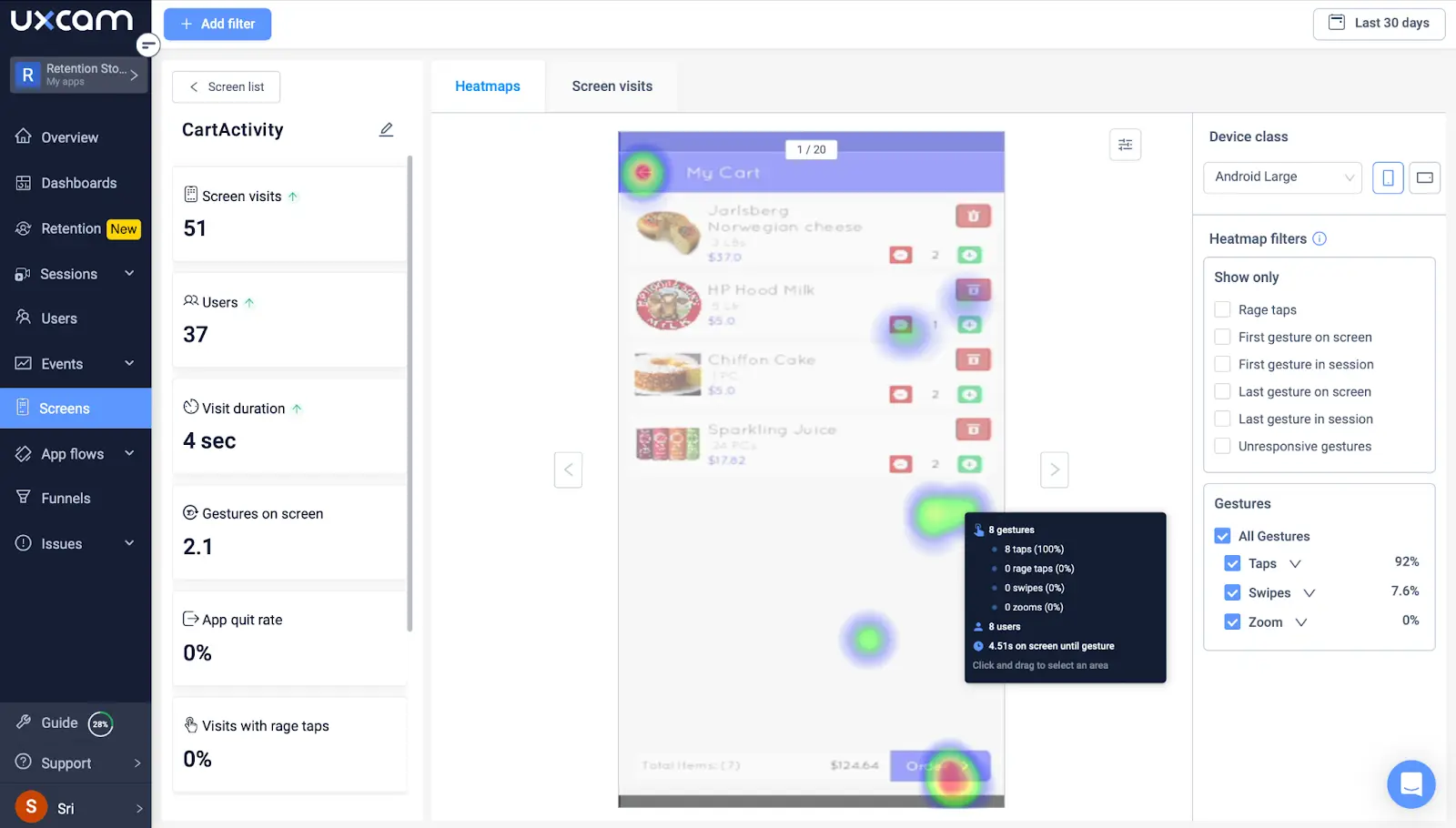
But how do you know what’s confusing? Heatmaps.


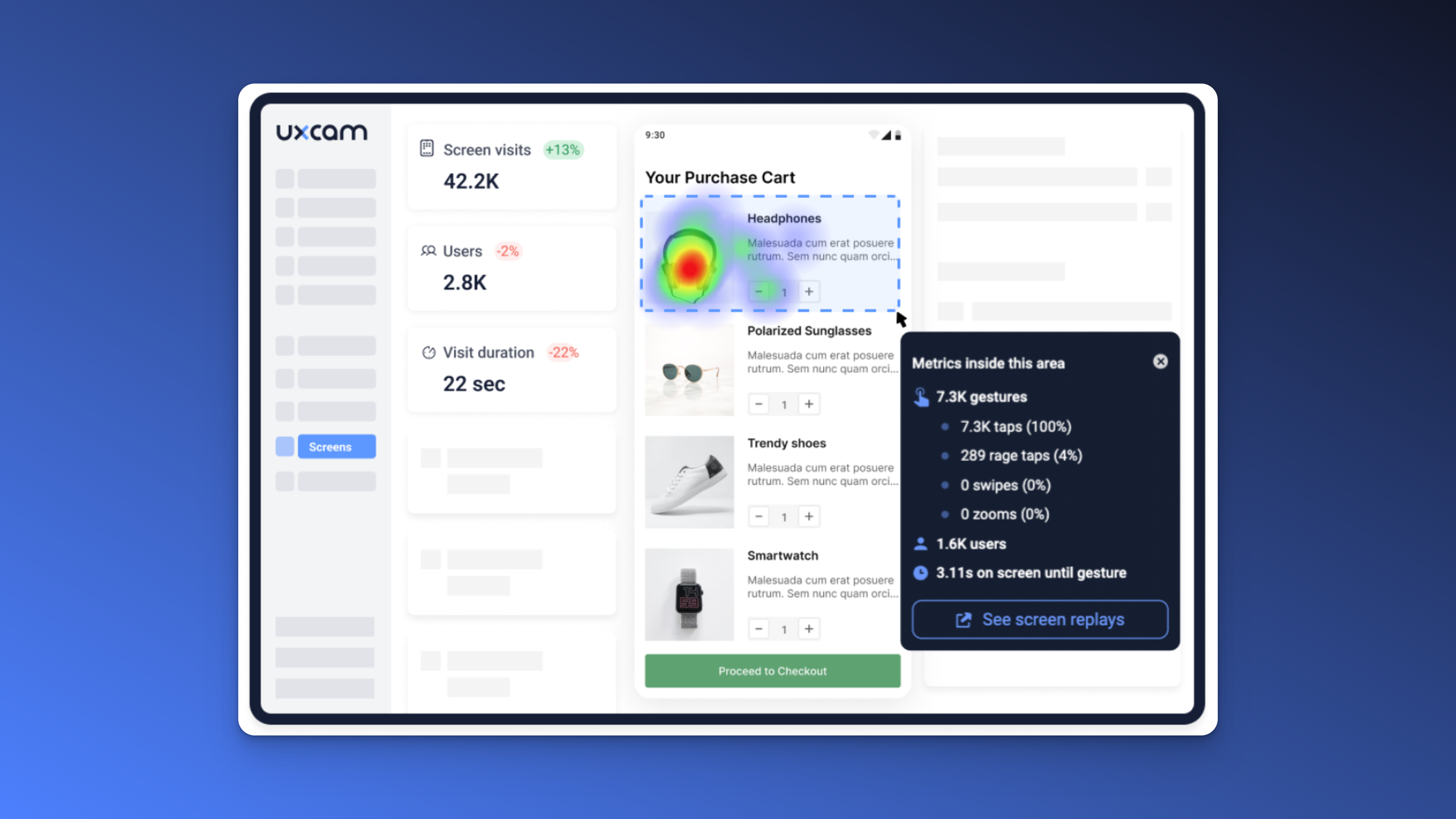
UXCam gives you a bird’s-eye view of where users focus—or where they don’t. You’ll see which elements attract attention, which get ignored, and where users stall. That’s your signal to simplify.
Good UX doesn’t wow with bells and whistles. It disappears into the background and lets users get things done without thinking too hard. And clarity? That’s the secret to speed, satisfaction, and scale.
5. Accelerate onboarding & time-to-value
You don’t get multiple chances to make a first impression. If your users don’t see value fast, they bounce. And once they’re gone, they rarely come back.
That’s why one of the most important things you can do as a PM is obsess over time-to-value—how long it takes a new user to experience their first “aha moment.”
For B2B? Maybe it's setting up their first dashboard. For B2C? Maybe it's uploading a photo or getting a recommendation. Whatever it is, identify it—and design your onboarding to drive straight to it.
Here’s the benchmark to aim for: 2 minutes. If a user doesn’t get to value in under two minutes, you’re likely losing them. That doesn’t mean cramming everything up front. It means removing anything that doesn’t help them get to that moment.
Pro tip: make your onboarding contextual, not linear. Show tips when they’re needed—not before.
Now, with UXCam Funnels, you can track how long it actually takes different users to hit that key action. Filter by device, cohort, or signup source. Then iterate. Tighten the flow. Test variations. Measure again.


This one insight—how fast users reach value—can transform your retention curve. Because the faster they succeed, the more likely they are to stick around, refer others, and explore the rest of what you’ve built.
6. Craft thoughtful micro-interactions
It’s the small things that make a product feel polished. Micro-interactions, those subtle moments like a button bounce, an inline validation, or a “saved” animation, don’t just look nice. They build confidence.
These touches reassure users that the product is working. They offer clarity, momentum, and sometimes even delight. And when done well, they reduce hesitation, prevent errors, and nudge users toward the next step.
But micro-interactions aren’t something you should throw in at the end. They should be intentional. Add them where they reduce friction, provide feedback, or celebrate progress. A checkmark after a successful submission. A subtle loading bar. A quick tooltip the first time someone uses a feature.
And here’s the trick: they have to feel invisible. Too flashy and it’s annoying. Too slow and it creates drag.


With UXCam, you can replay real user taps to see if your micro-interactions are helping or hurting. Are people pausing at a button? Tapping twice out of frustration? Dropping off mid-action? Those little insights help you fine-tune your timing, messaging, and motion.
The difference between a usable product and a lovable one is often just a few milliseconds of thoughtful design. Don’t overlook the details, they compound.
7. Adopt a consistent design system
Consistency isn’t just about aesthetics, it’s about trust.
When your UI elements look different from one screen to the next, users start questioning everything. Is that a button or a label? Is this screen broken? Did I do something wrong?
Every inconsistency creates mental friction. And every bit of friction slows your users down.
That’s why your product needs a living, breathing design system. Not just a Figma file that gets ignored, but a real system, versioned, documented, and audited regularly.
Your job as a PM isn’t to police pixel-perfect spacing. It’s to ensure design consistency across features, teams, and releases. That way, your users don’t have to relearn how your product works on every screen.
Here’s how we'd approach it: Once a quarter, pick a core flow, like signup, search, or checkout and audit every screen. Are buttons styled the same? Are modals positioned consistently? Are fonts and labels reused properly?
With UXCam, you can tag screens and spot variations across flows. Maybe the same component behaves differently on Android vs iOS. Or maybe a legacy screen still uses an outdated layout. Screen tagging helps surface these issues before your users do.


Inconsistent UX isn’t just a design debt, it’s a product risk. Fix it before your users notice. They may not say it out loud, but they feel it. And it shapes how they trust your product.
8. Prototype, test, and iterate fast
Speed matters, but only if you're learning fast, too.
As a PM, you’re constantly balancing urgency and quality. But here’s something I’ve learned over the years: you don’t need to be perfect, you need to be directionally right, fast.
That’s where prototyping comes in. Before your engineers spend days building a feature, test the concept. Use low-fidelity prototypes to validate assumptions. Put it in front of real users. Watch what they do. Listen to what confuses them. Iterate before the first line of production code is written.
You don’t need a fully interactive Figma flow or a coded staging environment. Sometimes a clickable wireframe is enough to catch a bad idea early, or validate a great one before your competitors get there.


Action tip: Use prototypes to answer one question at a time. “Do users understand what this feature does?” or “Do they click where we expect?” That’s all you need.
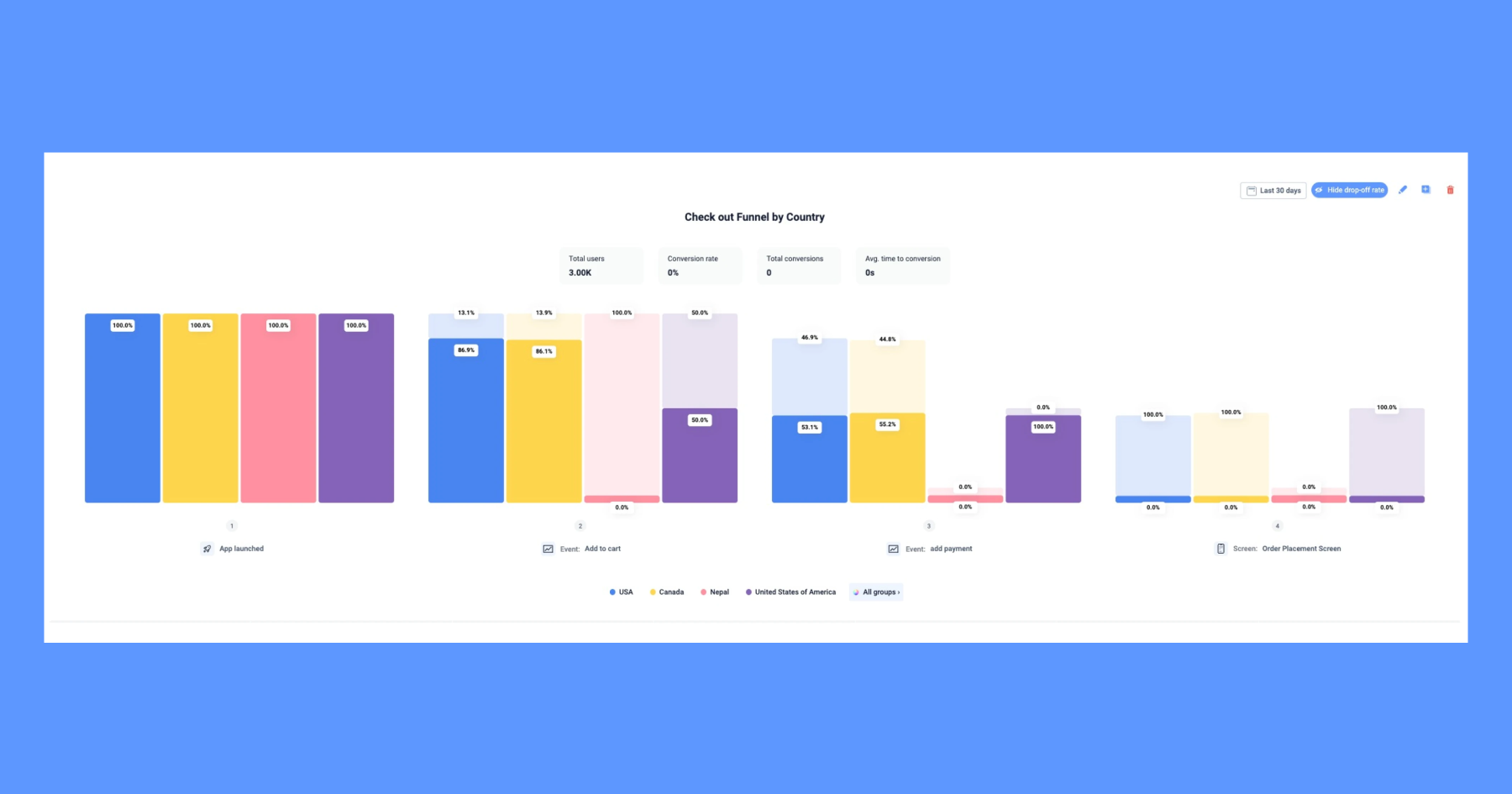
With UXCam, you can take it a step further. Run A/B tests using your prototype or MVP, and compare real behavior using Event analytics. Which version drives more engagement? Which one sees more drop-off? You’ll move faster and smarter.
Prototypes let you test ideas with minimal investment. Insights from real users show you which ones to scale. That’s how you build products with confidence, not guesswork.
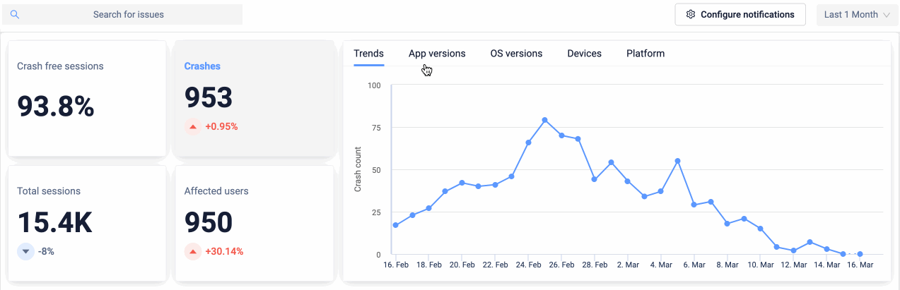
9. Monitor real-world performance
Let’s get real: if your product crashes, lags, or takes forever to load, nothing else matters. Not the design. Not the features. Not the clever onboarding flow you spent weeks perfecting.
Performance is the baseline of trust. When your product feels fast, reliable, and smooth, users stick around. When it doesn’t, they leave, without saying a word.
Your job as a PM isn’t to tune the code yourself, but it is your job to know when performance is slipping—and to push it up the roadmap when it matters.
Start by tracking the right metrics:
Crash rate
Page load time
Cumulative Layout Shift (CLS)
Each one tells a different story about how usable and stable your product really is.


Action tip: Don’t wait for complaints. Monitor these metrics continuously and benchmark them over time. A small uptick could signal a deeper issue.
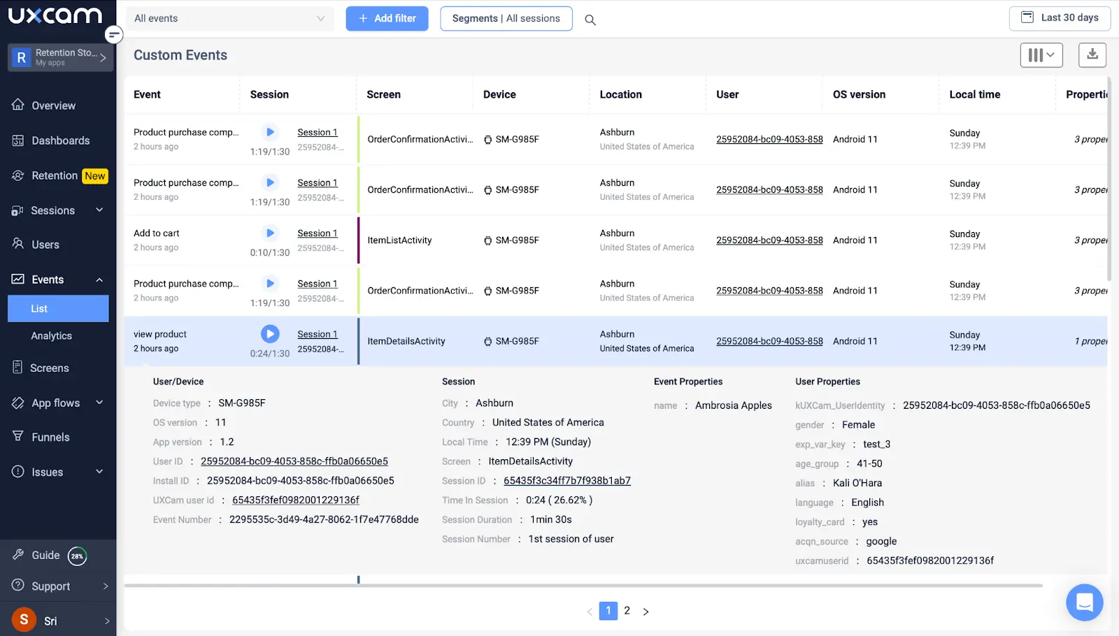
Here’s where UXCam gives you an edge: it autocaptures performance data alongside session replays. So you’re not just looking at crash logs, you’re seeing the exact user behavior that led to them. That context? Invaluable.
It’s easy to get lost in feature velocity and forget about performance. But your users feel it with every interaction. Stay ahead of it, and you’ll build a product that doesn’t just work, it earns trust at every click.
10. Eliminate dark patterns and build trust
You can trick someone into signing up once. But if they feel misled, they’ll never trust you again, and they definitely won’t become long-term users.
Dark patterns are UX designs that nudge users into actions they didn’t intend, like pre-checked boxes, hard-to-find cancel buttons, or confusing copy on pricing pages. And while they might boost short-term metrics, they wreck long-term relationships.
In today’s world, transparency is strategy. Users expect clarity, honesty, and control. If they don’t feel like they’re in the driver’s seat, they’ll churn, and call you out on social while they do it.
As a PM, it’s your job to protect trust in the product. That means:
Ditch deceptive modals
Make opt-outs easy and clear
Use straightforward language in CTAs
Don’t hide cancellation behind 5 clicks


Action tip: Add a “trust audit” to your next design review. Ask yourself: “Would I be okay with this experience if I were the user?”
With UXCam session replays, you can watch how users react to these patterns in real-time. Are they getting stuck in loops? Rage-clicking out of frustration? Bouncing from misleading flows? That’s your cue to fix it.
Trust isn’t something you build with a feature. It’s something you earn with every interaction. And when users trust you, they stick with you, because they feel respected, not tricked.
Common UX anti-patterns to avoid
Let’s talk about what not to do.
Even well-intentioned teams sometimes ship experiences that frustrate users. Why? Because they’re chasing short-term wins—like email captures or trial conversions—at the expense of long-term trust.
These are UX anti-patterns, and they’re everywhere. Sometimes they look like “best practices,” but in reality, they’re dark patterns in disguise.
Here are the big ones we'd recommend you watch out for in 2025:
Autoplay videos with sound – Nothing says “leave now” like a loud, unexpected video.
Confusing opt-outs or subscriptions – If a user needs a legal degree to cancel, you’ve lost them.
Popups before value is shown – Let them explore before asking for their email.
Excessive loading spinners – If you're making users wait, you're losing their trust.
Over-personalization without clarity – When your product feels creepy, not helpful, it backfires.
Your job isn’t just to get people through a flow. It’s to get them through it confidently, without deception, without confusion, and without regret.
If you’re not sure whether your experience is crossing a line, watch real sessions. UXCam session replays help you see where people hesitate, get stuck, or rage-click. That’s where trust starts to break and where your product has a chance to do better.
How do you measure UX success?
You can’t improve what you don’t measure. But UX doesn’t live in a single number, it lives in the outcomes users experience.
Here are the UX KPIs to track on every product:
Task completion rate – Are users actually finishing the flow they started?
System Usability Scale (SUS) – A quick, proven way to quantify perceived usability.
Time-to-value – How long does it take a user to hit that first “aha moment”?
User retention – Are they coming back after day one? Day seven? Day thirty?
Each of these metrics tells a different part of the story. Together, they show whether your UX is enabling or frustrating users.


Here’s how to bring this into your workflow: for every product KPI, pair it with a UX metric. If your activation rate is dropping, check time-to-value. If churn is creeping up, look at session replays to spot friction.
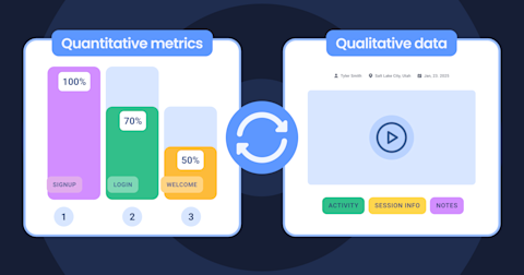
With UXCam, you get both the quantitative and the qualitative: Track events and funnels to measure flow efficiency, then use session replays to understand why users drop off.
That’s how you move from vanity metrics to product usability metrics that drive real decisions.
How to build a data-driven UX analytics stack
A lot of teams still rely on intuition or one-off usability tests to make UX decisions. That’s a good start—but it’s not enough.
Heuristics and best practices help early on. But once you’ve launched, you need data. And not just event counts or retention charts, you need context. You need to know what users did and why they did it.
Here’s the problem with most tools: they’re either all quant (like a product analytics tool) or all qual (like a research platform). But real UX decisions happen at the intersection of both.
Choose UXCam, a product analytics solution that combines quantitative data with qualitative insight.


You can see:
What users did (via events and funnels)
How they felt (via session replays and heatmaps)
When performance or design slowed them down (via autocaptured performance metrics)
And best of all? You don’t need heavy dev resources to set it up. Autocapture means you get value from day one, without weeks of instrumentation.
Your UX stack should answer more than just “what happened.” It should tell you why, show you how, and help you decide what to do next. That’s how you build a product users love and keep loving.
Conclusion - apply the UX principles
Great UX doesn’t happen by accident—it’s the result of consistent, intentional effort across your team. As a product manager, you have the power to shape experiences that not only work but feel seamless, trustworthy, and even delightful. Whether you’re fixing friction in onboarding, improving performance, or building trust through design clarity, every improvement compounds over time.
The best part? You don’t have to rely on gut instinct. With tools like UXCam, you get the visibility to understand user behavior, spot what’s working, and fix what’s not—faster.
Ready to turn these UX best practices into real product wins? Try UXCam for FREE today and build experiences your users will love.
You might also be interested in these;
UX Testing - Methods & Tools to Test User Experience
Mobile UX Design - The Ultimate Guide
19 Best UX Tools To Design a Better User Experience
UX Optimization - 4 Steps to Deliver a Better User Experience
14 Best Product Development Software for Every Team
AUTHOR
Tope Longe
Product Analytics Expert
Ardent technophile exploring the world of mobile app product management at UXCam.


Related articles


Curated List
7 Best AB Testing Tools for Mobile Apps
Learn with examples how qualitative tools like funnel analysis, heat maps, and session replays complement quantitative...


Jane Leung
Product Analytics Expert


UX design
12 UX Metrics to Measure and Enhance User Experience
Unlock product success by tracking the right UX metrics. Learn 12 essential metrics, how to measure them, avoid common pitfalls, and take action with tools like...

UX design
10 Top UX Design Best Practices & How to Implement Them
Discover 10 proven UX design best practices to improve usability, boost retention, and create user-centric products. Actionable tips for product...
Tope Longe
Product Analytics Expert