Back to blog
9 MIN READ
10 Proven Web Analytics Best Practices for Product Teams
PUBLISHED
15 April, 2025


Product Analytics Expert


Most product teams use web analytics, but few use it well enough to truly move the needle. “Good enough” might help you measure traffic. But it won’t show you where users drop off, why they churn, or what’s blocking conversions.
Web analytics is the process of collecting and analyzing user behavior data across your website to make better product decisions. When used correctly, it helps you understand the full customer journey—not just pageviews.
In this guide, you’ll get 10 proven website analytics best practices we’ve seen work across high-growth teams, plus a downloadable checklist you can use to audit your setup today.
We’ll go beyond surface metrics and into real techniques: funnel analysis, session replay, user segmentation, and how to combine qualitative and quantitative data.
We'll show examples of how to use UXCam to brings session-level behavior into the same view as your metrics, which helps you act faster and build better.
Let’s get into it.
Web Analytics Best Practices at a Glance
If you're short on time or need a quick gut check, here's a high-level view of the website analytics best practices We’ll break down in detail below.
These are the habits and systems that consistently lead to better insights, stronger experiments, and faster product wins.
| Best practice | Why it matters |
|---|---|
| Tie metrics to product KPIs | Keeps analytics focused on outcomes, not vanity |
| Build a structured event tracking plan | Ensures consistency, saves engineering time |
| Audit your analytics setup regularly | Prevents bad data from skewing decisions |
| Combine quant data with behavior insights | Tells you both what happened and why |
| Track user journeys across devices | Gives you a full view of the customer experience |
| Create real-time dashboards for teams | Drives alignment and faster decision-making |
| Use cohorts and segmentation to go deeper | Surfaces patterns you’d miss in averages |
| Analyze funnels to fix drop-offs | Identifies friction in high-impact flows |
| Design for privacy and compliance | Builds trust and avoids legal headaches |
| Close the loop with experiments | Turns insight into action through testing |
Tie analytics to clear product KPIs
Before you add one more dashboard or track another button click, ask yourself: What product decision will this data support? If you don’t have a clear answer, the metric probably doesn’t matter.
You need to tie every tracked event or report to a specific product KPI—activation, retention, engagement, or even NPS. That’s how you make analytics actionable, not just interesting.
Here's how we do it: Run a 30-minute stakeholder workshop with product, design, and engineering. We write down our product goals, then map which metrics reflect success. For example:
Signup = Activation
Daily usage = Engagement
Feature adoption = Stickiness
Survey responses = NPS
From there, we only track what moves those needles. Everything else is noise. This kind of data-driven decision-making builds confidence across the team—and reduces “reporting for reporting’s sake.”
Implement a robust event-tracking plan
Good analytics starts with good tracking. If your event names are inconsistent or no one knows what’s being tracked, it’s a liability, not an asset.
You need a plan. One that combines manual event tagging for key actions with autocapture to catch the edge cases you didn’t think of. This is where UXCam shine. You can auto-record taps, swipes, and screens without waiting on dev sprints. It’s a huge time-saver and gives you full coverage, even when specs are fuzzy.


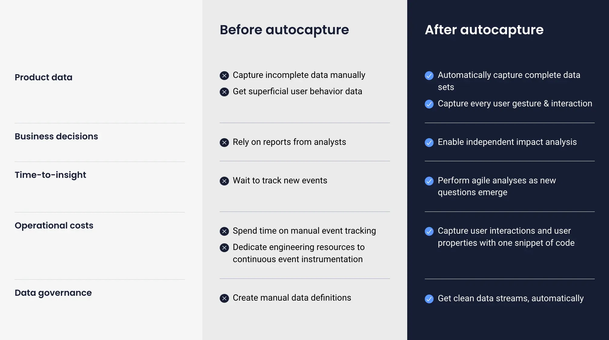
We always recommend setting up a data governance checklist early:
Use consistent naming (e.g., signup_success not SignUpDone)
Version your events if the flow changes
Document each event: trigger, category, and owner
You don’t need to track everything—just track the right things, well. This clarity will save your team hours later when you’re trying to diagnose an issue or make a roadmap call based on usage trends.
Audit your data quality regularly
If your data isn’t accurate, it doesn’t matter how beautiful your dashboards are—you’re making decisions in the dark. And trust me, we've seen more than a few roadmap meetings derailed by a mislabeled event or a silent tracking failure.
You need to treat data quality like code quality: proactive checks, not reactive fire drills.
Set up weekly anomaly alerts to catch sudden drops in tracked events, and do a monthly tracking plan review to check if new flows were launched without instrumentation.
Simple tools can go a long way here:
Use a data layer validator (even a dev console audit works in a pinch)
Watch sample session replays to make sure what you expect to track is actually being tracked
Fixing broken tracking after a launch is a painful conversation. Auditing regularly keeps your data trustworthy—and your team aligned.
Blend quantitative and qualitative insights
Numbers tell you what happened. But only watching users shows you why.
This is where behavior analytics comes in. Don’t stop at funnels and event charts. Pair them with session replays and heatmaps to uncover real friction—rage clicks, dead zones, confusing UX moments.
Here’s how we approach it:
Use quant data (drop-offs, low conversion) to flag where something’s broken
Use replays and heatmaps to uncover why it’s happening
Prioritize what to fix based on impact, not guesswork
If you’re wondering whether to watch 5 replays or analyze 5,000 events—start with the data. Once you spot a problem area, go deep on the qual side.
UXCam make this seamless. You can move straight from a funnel drop-off into real session footage, all in the same workflow. No context-switching, no guesswork.
This combo—quant + qual—is how you stop relying on assumptions and start building with real user empathy.


Track the full customer journey across devices
Here’s the reality: your users don’t think in platforms—they think in outcomes. They might discover your product on mobile, explore pricing on desktop, and convert a week later on a tablet. If your analytics only captures one part of that story, you're flying blind.
To build a product people love, you need visibility into the entire customer journey, not just isolated sessions.
You need to identify users across devices and stitch their sessions together with a unified ID, email, user token, or another persistent identifier.
With UXCam, you can view both mobile and web data side by side. One platform. One timeline. One customer journey. It helps you stop thinking in silos and start thinking in flows.
If you’re still reporting mobile and web metrics separately, it’s time to close that gap. Your customers already have.
Build real-time dashboards for stakeholder self-serve
You shouldn’t be the analytics bottleneck. If you’re the only one who knows where to find the answers, your team moves slower—and you get buried in “Can you pull this report?” requests.
The fix? Build real-time dashboards that your stakeholders can actually use.


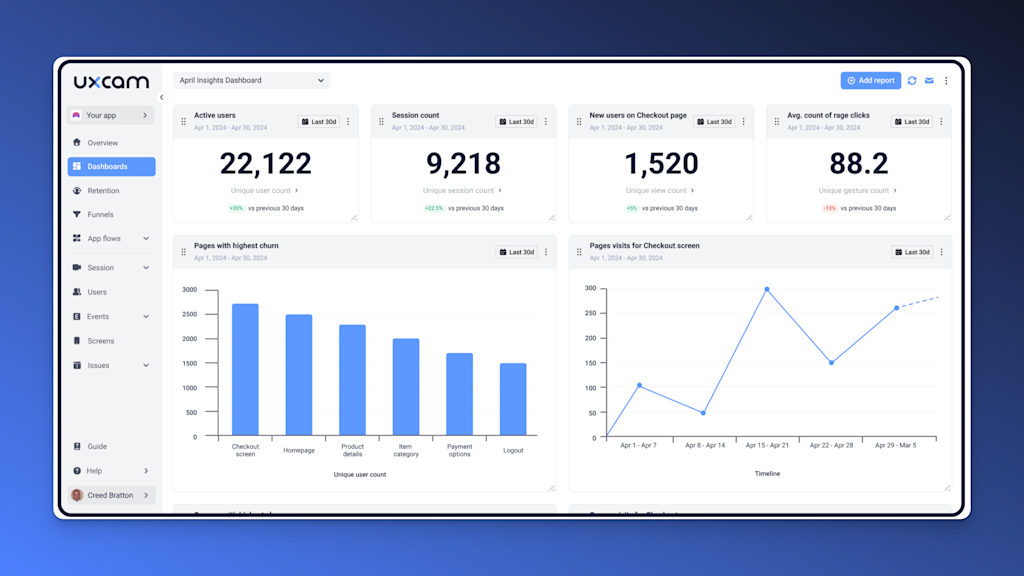
Start with the basics:
Traffic sources – to understand acquisition patterns
Top user flows – to see where users go after landing
Rage-clicks and dead clicks – to flag UX issues before support tickets pile up
Then make it easy to share. You could embed dashboards in Notion or Confluence, right next to our product specs or OKRs, so everyone has the context they need.
And here’s a tip from experience: always include a “What This Means” note under each chart. Data without interpretation just leads to more questions.
Dashboards aren’t just for visibility—they’re for alignment. Done right, they turn every team into a data-informed team.
Segment and cohort for actionable insights
If you’re still analyzing “all users” as one group, you're missing the story. Averages lie. Power users behave differently than new signups. Users who tried feature A might retain better than those who didn’t.
This is where user segmentation and cohort analysis come in.


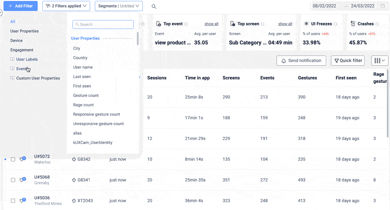
You need to slice your data by behavior, not just demographics. Look at retention cohorts—who came back after day 1, day 7, day 30? Then break that down further. What did the returning users do during their first session that others didn’t?
Want to see if your new feature is sticky? Build a feature adoption cohort. Group users who engaged with it and compare their retention or engagement to those who didn’t.
The goal here isn’t just to observe. It’s to learn what behaviors lead to better outcomes, then design your product to encourage those behaviors.
Smart user segmentation leads to smarter prioritization. It’s how you make sure you’re building for the right users, not just the loudest ones.
Diagnose drop-offs with funnel analysis
Funnels are one of your highest-leverage tools—if you use them right.
Start simple: pick a key journey (e.g. sign-up, checkout, onboarding). Build a funnel. Then look for the drop-off points. That’s your opportunity zone.


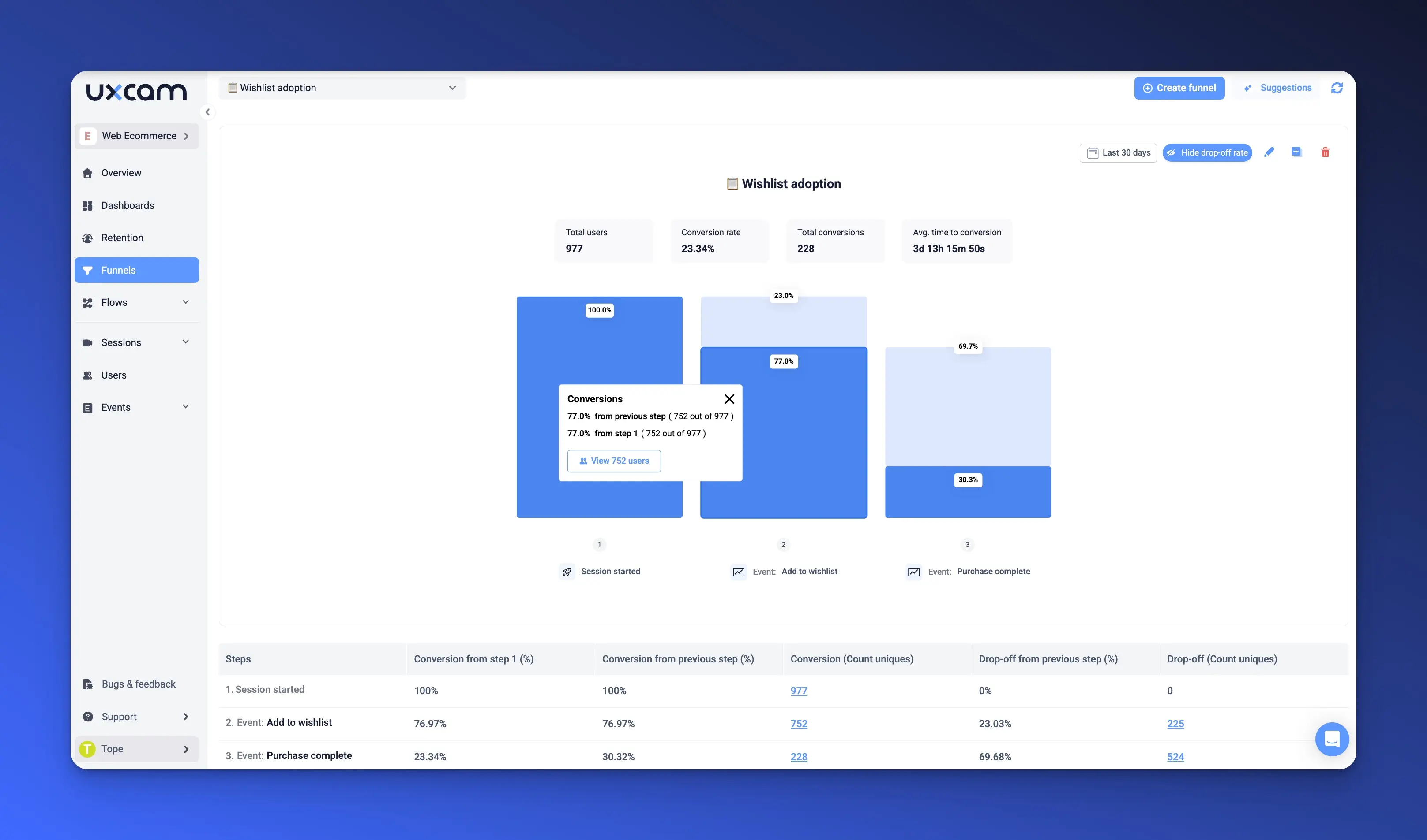
Now here’s the trick most PMs skip: don’t stop at the numbers. Once you see where users drop off, overlay session replays. Watch what they actually do—or don’t do. That’s where the friction lives.
Here’s a real example: We saw a 38% drop-off on a checkout page. Looked fine in the UI. But in replays, users were rage-clicking a disabled “Submit” button. A small fix—moving error text closer to the form—led to a 12% lift in conversions.
So here’s your playbook:
Build your funnel
Spot the biggest drop
Watch 5-10 replays from that step
Tag the friction points
Prioritize a fix
Measure impact
This loop turns data into decisions. And that’s what makes your analytics worth the effort.
Respect privacy & compliance by design
You can’t treat privacy like an afterthought. If you’re working with user data, especially at scale, compliance isn’t optional, it’s product hygiene.
That means designing your analytics to align with GDPR, CCPA, and other privacy laws from day one. Not just for legal peace of mind, but to build user trust. If users don’t feel safe, they bounce. And you lose long before your UX or features can prove their value.
Here’s what to cover:
Use consent banners that clearly state what you track
Prepare a cookieless fallback for regions that require it
Mask personally identifiable information (PII) before it ever hits your dashboards
With tools like UXCam, you get built-in PII masking, session anonymization, and consent management options—out of the box. That means you spend less time building compliance from scratch and more time improving the product.


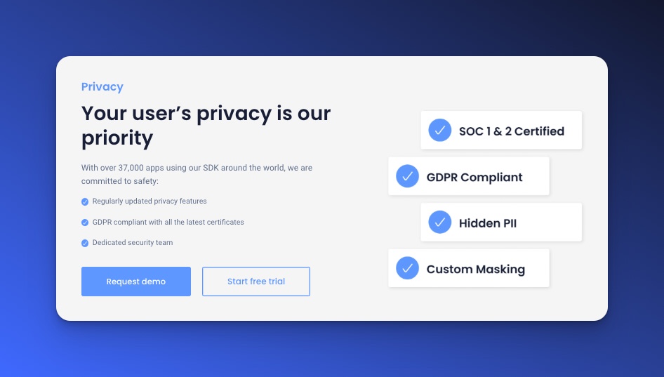
Bottom line: Good analytics is ethical analytics. Build it into your foundation, and you’ll never have to clean up a mess later.
Close the loop with experimentation & iteration
Analytics without action is just a history lesson.
Once you’ve found insights—drop-offs, underused features, user friction—you need to test solutions, learn fast, and ship improvements. That means making experimentation a habit, not an afterthought.
Keep an A/B testing backlog the same way you manage your product backlog. For every insight, write a simple hypothesis: “If we change X, we expect Y behavior to improve.” Then prioritize it like any other feature.
And don’t stop there. Bring analytics into your sprint retrospectives. What did we test? What moved the needle? What should we double down on next sprint?
When your team sees analytics as part of the product cycle—not just reporting—they get more curious, more focused, and more user-driven.
This is how you build a culture of continuous improvement. And that’s where product teams really start to shine.
How to choose the right web analytics tool
Choosing a web analytics tool isn’t just about features—it’s about fit. You need a tool that supports your speed, matches your stack, and grows with your product.
From experience, here are the three things we always look for—and why UXCam checks all the right boxes:


| Must‑have | Why it matters | UXCam Edge |
|---|---|---|
| Event + behavior Data | Numbers show what happened. Behavior shows why. | Event, Filters, Session replay and heatmaps in the same UI |
| Fast setup | You don’t have months for implementation. | Autocapture—no SDK gymnastics or custom tagging needed |
| Full user journey View | Users switch between mobile and web. | One tool to track both mobile and web |
If your tool only gives you charts, you’re flying half-blind. You need session-level context to understand real user behavior—rage clicks, friction points, hesitations—things numbers alone won’t surface.


And you need to move fast. The best tools don’t slow down your roadmap, they support it. That’s why we lean on UXCam, especially when building across web and mobile. One workspace. Full context. No data gaps.
Pick a tool that works the way your team works and you’ll get insights that actually drive action.
Conclusion
The best product decisions aren’t based on gut—they’re grounded in insight. When you apply these website analytics best practices, you turn raw data into a real advantage: faster experiments, tighter feedback loops, and a product that truly fits your users.
It’s not about tracking everything. It’s about tracking what matters—and knowing what to do with it. That’s where the real leverage is.
Ready to see these best practices in action? Start a free UXCam Web trial and watch your next release ship with confidence.
You might also be interested in these;
Website Visitor Tracking - A Comprehensive Guide
Top 10 Digital Analytics Tools You Need to Know
Ultimate Website Optimization Guide: Must-Know Tactics
Website Analysis 101: How to Analyze for Peak Performance
AUTHOR
Tope Longe
Product Analytics Expert
Ardent technophile exploring the world of mobile app product management at UXCam.
What’s UXCam?
Related articles


Website Optimization
AI Conversion Rate Optimization - What It Is & How It Works
Boost your website performance with AI Conversion Rate Optimization. Learn how AI tools analyze behavior, personalize UX, and increase conversions...
Tope Longe
Product Analytics Expert


Website Optimization
10 Best Landing Page Optimization Tools
Boost conversions with the 10 best landing page optimization tools. Compare features, pricing, and use cases for growth-focused...
Tope Longe
Product Analytics Expert


Website Optimization
How to Improve User Experience on Website
Improve website UX with 10 proven tips for product managers. Learn how to spot issues, reduce friction, and boost conversions using UXCam for...
Tope Longe
Product Analytics Expert