14 Website Analytics Metrics to Track for Product Teams


You already track the basics—page views, bounce rate, sessions. But are those numbers telling the full story?
The truth is, most website analytics metrics offer surface-level insights. They show what’s happening, but not why it’s happening or how to fix it.
To truly understand how users interact with your product, you need to dig deeper into website analytics metrics that reveal patterns, friction, and opportunities. The right data helps you connect the dots, from traffic sources and user behavior to engagement drop-offs and conversion gaps.
n this guide, you’ll explore 12 essential metrics every product manager should track—plus how to turn them into actionable insights. And along the way, you’ll see how tools like UXCam bring these numbers to life.
Let’s dive in.
Summary - Key website metrics
Here's a list of the key website analytics metrics you should be tracking to drive growth.
| Website Metric | What it helps you understand |
|---|---|
| Unique Visitors | Are you growing or recycling the same user base? |
| Page Views & Sessions | Are users exploring or exiting after a quick glance? |
| Traffic Sources | Which channels bring qualified, high-intent users? |
| Bounce Rate | Are visitors finding value or leaving immediately? |
| Average Session Duration | Are users meaningfully engaging or confused and circling? |
| Pages per Session | Is your site built for discovery or leading to dead ends? |
| Interaction Events | Are users actively engaging or passively browsing? |
| Conversion Rate | Are users completing key actions that matter to the business? |
| Funnel Drop-Off Rates | Where in the journey are users abandoning your flow? |
| Form Abandonment Rate | Are your forms driving signups or silently killing them? |
| CTA Click-Through Rate (CTR) | Is your messaging and layout motivating next-step action? |
| Retention & Loyalty Metrics | Are users returning because they see lasting value? |
| Customer Satisfaction Metrics | How do users feel about your product experience? |
| Technical Performance Metrics | Is the website fast, stable, and technically reliable? |
What are website analytics metrics?
Website analytics metrics are data points that measure how users interact with your website.
They show how people arrive, what they do, how long they stay, and whether they complete important actions—like signing up, clicking a button, or leaving immediately.
These metrics fall into key categories like traffic metrics, user engagement metrics, and conversion metrics. Each one offers a different lens into your product’s performance.
At their core, web analytics metrics help you track website performance, analyze user behavior, and uncover where your site is helping—or hurting—the user experience.
For example, metrics like bounce rate, pages per session, and session duration can help you spot friction points. Others, like conversion rate or event tracking, reveal whether users are doing what you want them to do.
So why do these metrics matter?
Why do website metrics matter?
Because you can’t improve what you can’t measure.
If you’re managing a SaaS product, you already know user experience is everything. But assumptions aren’t enough. You need hard data to see what’s working and what’s not.
Website analytics metrics give you that clarity.
They show you if a new feature is driving sign-ups, or if users are getting stuck halfway through a funnel. They help you prioritize where to improve and back up your product decisions with real evidence.
When you use a platform like UXCam, you go beyond the numbers. You get visual context like session replays and funnel analysis, to see not just what users did, but why they did it. And that’s the difference between guessing and knowing.


Now let's get into the essential metrics you need to track.
Website traffic metrics
Website traffic metrics helps you understand how people are getting to your site and how many are actually showing up.
These metrics help you measure visibility, identify top-performing channels, and understand how users move through the top of your funnel.
They form the foundation of every data-driven product decision, because if no one’s coming to your website, no one’s converting.
Let’s break down the key traffic metrics you should track.
1. Unique visitors
Unique visitors metric helps answer the question; are you growing, or just recycling traffic?
At face value, unique visitors is a simple metric, it tells you how many distinct individuals visited your website in a given time frame. But in product, it’s rarely about the number alone.
What you’re really looking for is signal. Are you attracting new people who haven’t experienced your product before? Are your acquisition channels expanding your reach, or are you just cycling through the same pool of returning users?
A rising returning visitor count shows loyalty and retained interest, which is great. But if your new visitor growth stalls, it’s a leading indicator that your top-of-funnel engine, SEO, paid campaigns, referrals, might be plateauing.
This balance matters deeply. A healthy SaaS product needs a consistent influx of new users to fuel growth, but returning visitors tell you the experience is worth coming back for. Ideally, both trend upward together.
When you see imbalances, say spikes in new visitors but low return rates, it’s often a sign that your product promise is working to attract, but the experience isn’t delivering on it.
You should use this metric not just to gauge audience size, but to raise strategic questions: Are we acquiring the right users? Are we retaining them? And are we telling a compelling story from ad click to product value?
2. Page views and sessions
It helps to helps answer the question; are users discovering value or bouncing off?
Sessions give you the number of site visits. Page views show how much of your content is being consumed during those visits. Together, they help you understand depth of engagement.
A high session count with low page views? That’s often drive-by traffick, mostly users landing, looking around briefly, and leaving without real exploration. It’s a red flag for relevance or navigation.
On the flip side, if you’re seeing high page views per session, that suggests curiosity and stickiness. Users are discovering value and moving through your content paths.
Here’s the deeper insight we’ve learned over time: page depth alone isn’t always good. You need to ask, what are they viewing and why? Are they progressing down a clear conversion path or are they lost in a maze of content?
This is where traditional analytics falls short. Numbers alone don’t tell you how a user experienced your website site. Tools like UXCam give you visibility into actual user sessions, so you can see if a 5-page session was healthy exploration… or pure confusion.


For product managers, this metric pairing is less about traffic volume and more about identifying content friction, validating navigation strategy, and spotting unintentional dead ends.
3. Traffic sources
Answers the question: Which channels drive the users you actually want?
Not all traffic is equal.
Traffic source metrics show how people land on your site, via organic search, paid ads, social referrals, email campaigns, or direct links. But the key question isn’t where they came from, it’s what kind of users they are.
You may find that organic search brings high volume, but those users bounce in seconds. Meanwhile, a small but steady stream from partner referrals engages deeply and converts at twice the rate.
That’s where traffic source analysis becomes strategic. You’re not just evaluating reach, you’re evaluating intent and quality.
As a product leader, we’ve often used this data to inform not just marketing allocation, but positioning. For example, if users coming from a specific niche blog have a high trial-to-paid conversion rate, it tells me the messaging and audience alignment are spot on.
It also improves cross-team alignment. Product and marketing can collaborate more effectively when we’re not just chasing “more traffic,” but focusing on the right traffic, the kind that signals product–market fit and long-term value.
Pro tip: Pair traffic source insights with behavioral data. With UXCam, you don’t just see which channel brought a user in, you see exactly how they behaved after landing. Did they explore? Rage click? Complete a key action? That context is gold. While traditional tools show you where users come from, UXCam goes a step further. It links those visitors to real behavior, using session replays and interaction data to show you what users did once they landed.


These traffic metrics are more than top-line indicators. They’re strategic levers.
They help you spot early signs of growth ceilings, uncover content gaps, and align teams around what truly drives meaningful engagement.
Next, let’s dive into engagement metrics, where the quality of those visits starts to take shape.
Engagement metrics
Once users land on your site, the next question is: are they staying, engaging, and moving toward value—or leaving immediately?
That’s where engagement metrics give you the real story. While traffic metrics tell you how many people arrived, engagement metrics reveal what those people actually did—and whether your product resonated.
They help you separate casual visits from meaningful interactions, so you can focus on improving the parts of your experience that truly matter.
What engagement metrics show how users interact with your website?
Here’s how to approach the core user behavior metrics every product manager should keep a close eye on:
4. Bounce rate
Helps to answer the question: are visitors finding what they expected or disconnecting?
Bounce rate is one of those metrics that’s easy to track but harder to interpret correctly. At its core, it tells you how many users leave after viewing just one page, no clicks, no scrolls, no engagement.
But as with most things in product, context is everything.
A high bounce rate can be a symptom of several underlying issues. It could mean your content missed the mark. It could reflect slow performance or a poor mobile experience. Or, more subtly, it might signal a disconnect between your acquisition strategy and your actual product value.
For example, if you’re driving paid traffic to a feature page that’s not immediately clear or aligned with the ad promise, users won’t stick around. They bounce, not because they weren’t interested, but because the experience failed to meet their expectations in the first five seconds.
As a product manager, treat bounce rate as a proxy for relevance and first-impression clarity. It’s less about the metric itself, and more about what it reveals: your users came with intent, did you deliver quickly enough?
If your bounce rate is 80%+ on high-intent pages like your pricing, onboarding, or product overview pages, you need to act. Focusing on three key areas usually moves the needle:
Speed: Page load time still kills engagement. Users won’t wait.
Clarity: The headline and visuals should communicate your value prop in 3 seconds or less.
Focus: Strip distractions. One CTA is better than five.
5. Average session duration
It helps to answer; are users spending real time or just killing seconds?
Average session duration measures how long, on average, a user spends on your site during a visit. Most teams see this as a proxy for interest or engagement, and to some extent, that’s true.
But duration, by itself, is a blunt instrument.
A longer session might mean your content is compelling or it might mean your UI is unclear and users are hunting for answers. Likewise, short sessions could mean people bounced... or that they found what they needed and converted instantly.
That’s why session duration should never be interpreted in isolation.
It's best to look at this metric alongside behavior. Are users scrolling, clicking, engaging with CTAs? Are they completing key flows, or just circling?
If session duration is short and bounce rate is high, it’s a red flag for content or navigation. But if duration is short and conversions are high? Great. That means your experience is efficient and purposeful.
The key is intentional design. Every page should have a next step, something meaningful to click, discover, or act on.
The go-to rule: no dead ends.
Embed related content. Surface product use cases. Offer a next best action. If your users spend 60 seconds on a page, make sure that minute matters, not just for vanity metrics, but for moving them toward value.
6. Pages per session
This metric helps to answer; Are users curious—or just circling the drain?
Pages per session isn’t just a measure of how much content a user consumes—it’s a reflection of how well your site supports discovery, momentum, and value delivery.
When you evaluate this metric, you are not just looking for a number. You should be asking: What does the user journey feel like? Are we making exploration effortless or exhausting?
If a user visits 3 to 5 pages, that suggests a logical and engaging flow. They’re finding value and being guided toward it. But when you’re stuck at 1 to 2 pages, especially paired with high bounce or exit rates, it’s often a sign of one of two things: either users found everything they needed on one page (which is rare in SaaS), or they didn’t find a compelling reason to continue.
And that second scenario should concern you.
Over the years, we’ve seen this metric suffer in products where pages are designed in isolation where feature pages that don’t link to case studies, documentation that doesn’t tie back to the product, CTAs that are either missing or too generic. What’s missing isn’t more content, it’s connective tissue.
You need to think like story architects. Each page should naturally lead to the next chapter in the journey. This is what we call experience choreography, designing flows that anticipate the user’s next question and serve it up with minimal effort.
One tactic used with great success is improving the information scent. Are you clearly signaling what happens next? If the user scrolls, clicks, or hovers, do they feel like they’re uncovering value or hitting dead ends?
Sometimes the fix is simple: embed a customer quote on a product page, link to a live demo on a pricing page, or surface a “Compare Plans” CTA right after listing features.
Small changes, compounded over time, create a website that invites curiosity rather than punishes it.
7. Interaction events
With interaction events, you can answer; Are users engaging—or just enduring the experience?
This is where analytics shifts from measuring volume to uncovering intent.
Interaction events like clicks, taps, scrolls, hovers, form entries, video plays, give you the richest signals of whether users are actually engaging with your content, or just scanning through it on autopilot.
And our my experience, this is the most underused layer of data in most product orgs.
Traditional metrics like bounce rate and session duration give you a sense of how long a user stayed or where they dropped. But they won’t tell you what happened in between. That’s the gap interaction data fills.
For example, we once led a team that launched a new pricing page. Time-on-page was strong, bounce rate was low, but conversions were flat. When we reviewed interaction heatmaps, we saw users were heavily engaging with a table comparison, but rage-clicking on a disabled toggle that looked interactive.
That small UI issue created friction at the exact decision moment. This kind of behavioral nuance is what helps you separate anecdotal feedback from systemic friction.
When you track interaction events in detail, you start to spot UX friction you can’t unearth in surveys or NPS scores. You see if users are ignoring your CTA. You see if they scroll halfway and bail. You learn whether your most important elements are even being seen.
But to unlock this, you need tools that go beyond the basics.
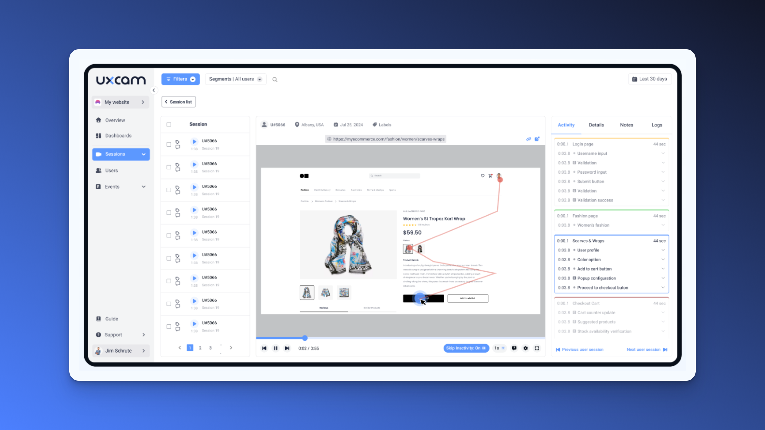
That’s where UXCam comes in. It doesn’t just track interactions, it contextualizes them. With session replays and smart event, you can literally watch how real users move through your product, where they pause, where they struggle, and where they convert.
[Image]
We’ve seen teams uncover high-impact issues in minutes using UXCam, like a mobile modal that covered key content, or a call-to-action that fell below the fold for 80% of users. You won’t catch these in Google Analytics.
And once you do? You don’t just fix a bug. You clear the path to value.
That’s what interaction data is all about. It’s the closest thing to walking in your user’s shoes at scale. And as a product manager, that’s the level of empathy and clarity that turns metrics into momentum.
Conversion metrics
At the end of the day, traffic and engagement are just the beginning. The real question is: are users taking action?
Conversion metrics tell you whether your product is delivering value, and whether your website is effectively communicating it. These are the numbers that tie product experience directly to business outcomes.
As product leaders, we don’t just track conversions for reporting. We use them to pinpoint friction, refine user flows, and align teams around the moments that matter most, signup, purchase, activation.
What conversion metrics should you track to drive growth?
Let’s break down the four conversion metrics I rely on the most.
8. Conversion Rate
It helps you answer: Are users doing what you actually need them to do?
Conversion rate is often treated like a simple performance gauge, track it, report it, move on. But when you’re responsible for a product’s growth trajectory, you learn quickly: it’s not just a metric. It’s a mirror.
It reflects the effectiveness of your messaging, the clarity of your value proposition, and the smoothness of your experience. If something’s off in any of those layers, conversion rate exposes it, often before you hear it in feedback or see it in churn.
A 5% conversion rate on your pricing page doesn’t mean your design is working. It means 95% of people didn’t convert. That’s where the work begins.
Here’s the nuance most teams overlook: conversion rate is cumulative. It’s the sum of a series of micro-decisions users make, before they ever reach the CTA.
Is the product promise clear the moment they land? Does the content build trust and urgency? Is the pricing structured in a way that aligns with how the user sees their own needs?
If you see conversion rates lagging, don’t start by looking at the button. Start upstream:
Is the offer framed correctly for the target segment?
Are we surfacing key benefits in the order the user actually evaluates them?
Are we unintentionally creating anxiety, either through poor copy, unclear commitment, or information overload?
For example, one of the most impactful changes I’ve ever made was removing ambiguity. We clarified what “Start Free Trial” actually meant—no credit card, cancel anytime, quick setup. Just that simple tweak lifted conversions by 18%, without changing the product at all.
Conversion optimization isn’t just UX. It’s strategy made visible.
9. Funnel drop-off rates
Helps to answer; Where are you losing high-intent users?
Every product experience has a flow, whether that’s browsing, onboarding, checkout, or demo requests. And no matter how good your traffic is, you’ll never capture full value if that flow is leaky.
Funnel drop-off metrics help you locate where motivated users abandon the journey. And as a product team, treat this as one of the most actionable signals in the stack.
Let’s say you have a four-step signup process. Traffic looks solid. Initial clicks are high. But only a small percentage complete the final step.
Now, here’s the trap I’ve seen teams fall into: they assume it’s a step-level issue. “Let’s tweak step 3.” But drop-off is rarely isolated. It’s usually the result of cumulative friction that finally pushes the user to quit.
This is where context is everything.
Using a tool like UXCam, you don’t just look at numbers, you watch the sessions. You want to see where users hesitate, rage-click, or backtrack. That’s how we found one of our biggest drop-off drivers: a password field with overly aggressive validation. No error message, no guidance—just silent failure.
Fixing it took 20 minutes. Our completion rate jumped by 27%.


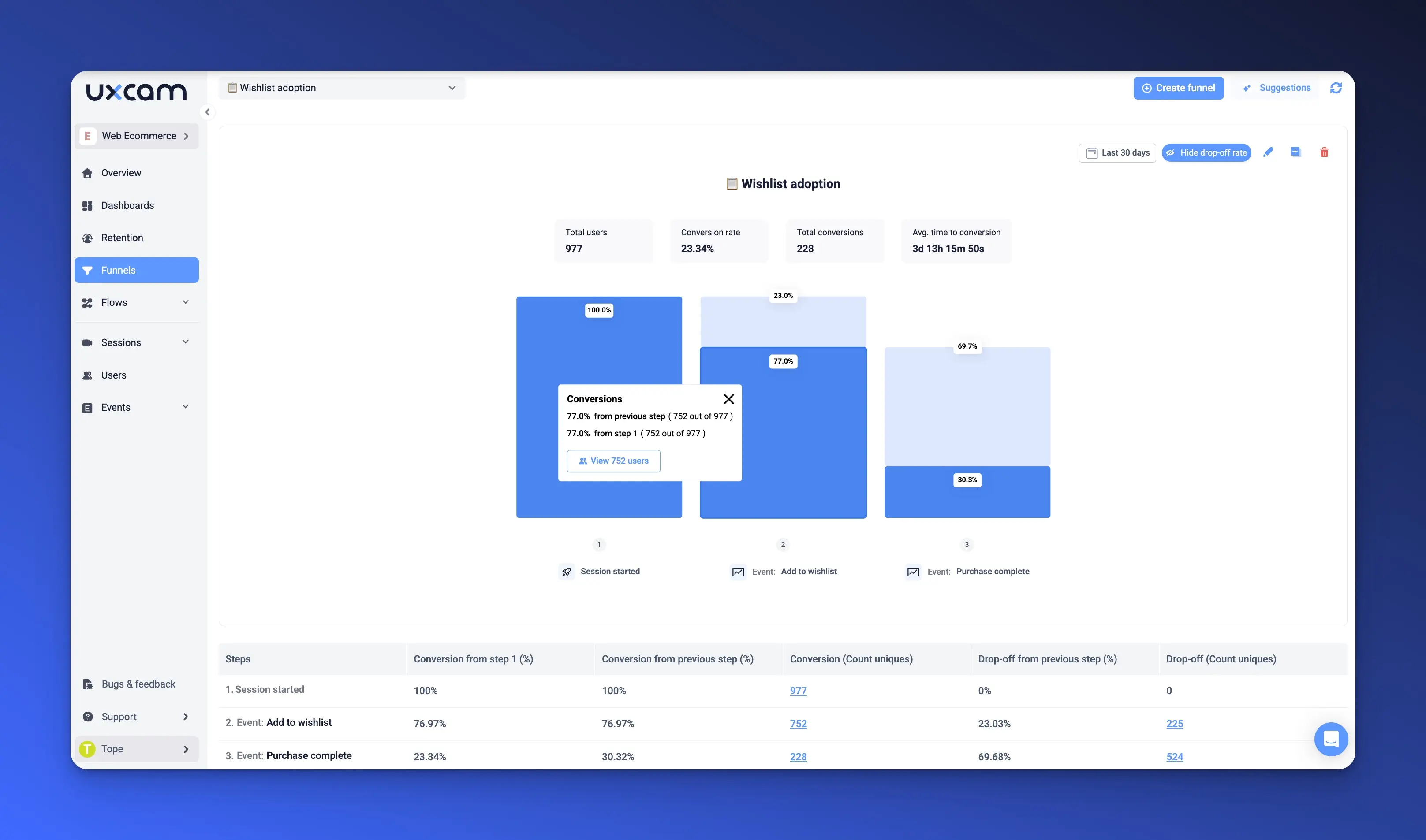
Here’s the key lesson: drop-off doesn’t always come from disinterest. Often, users want to finish. They just can’t or they don’t trust the next step. Your job is to find and fix the moments where momentum dies.
That’s not just funnel optimization. That’s experience design at a strategic level.
10. Form abandonment rate
This helps to answer; Is your form silently killing conversions?
In SaaS, your forms are often your growth engine. Sign-ups. Demo requests. Trials. Every one of those hinges on a form and every unnecessary field introduces risk.
Form abandonment rate shows how many users start but don’t finish filling out your form. And when that rate is high, it’s usually not a mystery. It’s friction, plain and simple.
Over the years, we’ve reviewed hundreds of forms, and here’s the pattern we see again and again:
Asking for too much, too soon
Poor field sequencing (putting effort before value)
Vague or missing guidance (what format do I use? Why is this required?)
Errors that don’t explain themselves
For example, in one onboarding flow, you asked for 12 fields upfront. Conversion hovered around 15%. When you stripped it back to 5 essential fields and deferred the rest until post-signup. Completion jumped to 59% and more importantly, downstream activation didn’t drop.
Users aren’t unwilling, they’re cautious. They don’t want to commit without clarity or payoff. Your form’s job is to lower the perceived cost of getting started.
This is where UXCam shines. Watching a session recording where a user gives up halfway through a form teaches you more than any heatmap ever will. You’ll see exactly where they hesitate, what they try to fix, what frustrates them.


Great forms don’t just convert, they respect the user’s time, intent, and uncertainty.
11. CTA Click-Through Rate (CTR)
This answers the question; Are users motivated to take the next step?
You can craft the most persuasive landing page or detailed product tour, but if your users aren’t clicking the call-to-action, none of it moves the business forward.
Click-through rate (CTR) is one of the clearest micro-conversion signals we have. It measures how often users engage with key CTAs like “Start Free Trial,” “Request a Demo,” or “Get a Quote.”
But in practice, CTR is less about button clicks and more about decision readiness. A low CTR doesn’t always mean poor traffic, it usually reveals a gap between the desire a user has and the confidence they need to act.
Sometimes, that’s a copy issue. I’ve seen conversion lift 20% by changing “Learn More” to “See Plans” because clarity reduces hesitation. In other cases, it’s visual hierarchy: the CTA is buried, blended, or competing with distractions.
More often, it’s misalignment. The CTA promises something the surrounding content doesn’t reinforce. There’s no proof, no urgency, or the offer comes too early in the journey.
That’s why you should treat CTR as a diagnostic tool, not just a performance stat. It tells you if the path you’ve designed is convincing enough to make someone commit to the next step.
But CTR alone won’t tell you why a user didn’t click. You need a product analytics solution like UXCam.
By layering session replays, funnel insights, and click interaction data, UXCam shows you not just where users stall, but how they behave in that moment. You’ll see them scroll past the CTA, hover over it, or click elsewhere out of confusion.
Other website metrics
Traffic, engagement, and conversion metrics form the core of most analytics dashboards. But to truly understand the health of your product, you need to look beyond the obvious.
Product teams often miss critical insights by not paying enough attention to what happens after the first visit, or what’s happening beneath the surface. These “supporting” metrics—retention, satisfaction, performance, and device-specific behaviors, aren’t just add-ons. They’re where competitive advantage hides.
Let’s break them down.
What other important website metrics should you track?
12. Retention & loyalty metrics
Helps to answer: Are users sticking around?
Retention is often the most honest measure of product value. Users might sign up because of good marketing—but they come back because the product works for them.
Metrics like Returning User Rate, DAU/MAU, or Churn Rate tell you whether your product has staying power. A healthy DAU/MAU ratio (especially for B2B SaaS) indicates you're becoming a habit. A low returning user rate? That’s your early-warning system.
Too many teams optimize for acquisition while ignoring drop-off. But if your product doesn’t retain, you’re pouring water into a leaky bucket. Retention should have just as much roadmap visibility as growth initiatives.
And you can’t fix retention without visibility into why users don’t return. That’s where session replay tools like UXCam become essential. Watching the first 60 seconds of a failed user journey reveals far more than any exit survey ever will.
13. Customer satisfaction metrics
What’s the emotional signal behind user behavior?
Behavioral data tells you what users did. Satisfaction metrics—like NPS and CSAT—tell you how they felt about it.
It’s easy to dismiss NPS as just another vanity score. But when paired with usage data, it becomes powerful. For instance, if heavy users give you low NPS scores, that’s not praise for “power users”, it’s a signal of growing pain or frustration.
You can use NPS feedback to uncover UX problems your telemetry never caught. “Clunky navigation,” “too many steps,” “confusing billing.” These don’t always show up in drop-off charts, but they accumulate and cost you referrals, upsells, and renewals.
Combine satisfaction scores with UXCam’s behavioral insights and you’ll stop guessing which part of your experience users are frustrated with, you’ll see it.
14. Technical performance metrics
This helps your figure out; Is the product experience stable and fast?
Speed and stability are product experience fundamentals. Yet too often, Page Load Time, Time to Interactive, or JavaScript Errors live in engineering silos, when they should be on the product dashboard.
Why? Because users don’t separate performance from functionality. A slow product is a broken product.
We’ve seen a 300ms latency increase result in a 15% drop in conversion, especially in mobile environments. Trust is fragile, and a poor technical experience erodes it quietly.
The most successful product orgs treat performance as a first-class product feature, not a backend responsibility. That means obsessing over front-end performance and instrumenting every major release for real-world load time.
Pro Tip: The metrics above don’t live in silos, and neither should your analysis.
The most effective product teams tie quantitative metrics to qualitative behavior. They don’t just see that bounce rate is up, they use UXCam to watch what happened before the exit. They don’t just see retention dip—they investigate why onboarding failed by following real session paths.
When you connect these “other” metrics with context and tooling, you move beyond dashboards, you start managing the actual experience. And that’s how world-class products are built.
Conclusion
Website analytics metrics are more than just numbers—they’re signals. Signals of what’s working, what’s breaking, and where your users are quietly struggling.
But metrics alone don’t drive growth. What matters is how you interpret them, prioritize based on them, and act with precision and speed.
As a product leader, your job isn’t to chase every datapoint—it’s to identify patterns, connect the dots across user behavior, and make informed decisions that move the business forward. That means pairing quantitative data with qualitative context.
You need a solution like UXCam that goes beyond traditional analytics, so you're not just tracking clicks or bounce rates, but understanding why users dropped off, got frustrated, or didn’t convert. With session replays, funnel analysis, and gesture tracking, you get the full picture.
If you’re serious about building better experiences and smarter funnels, stop guessing. Start seeing what your users see. Try UXCam for free and turn your metrics into meaningful action.
FAQs
Website Analytics Metric FAQs
What are website metrics?
Website metrics are measurable data points that help you understand how visitors interact with your website. They reveal patterns in user behavior, engagement levels, traffic sources, and conversion outcomes. Product managers rely on website metrics to assess site performance, identify friction, and guide improvements that align with business goals.
What are the top 3 website performance metrics to monitor?
The most important website performance metrics focus on visibility, engagement, and outcomes. These include how many users visit (traffic volume), how long they stay and interact (user engagement), and whether they complete key actions like signing up or purchasing (conversion rate).
How do you measure the performance of a website?
You measure website performance by analyzing a combination of behavioral and technical metrics. Performance is best evaluated through a mix of traffic data, engagement signals, conversion outcomes, and technical stability. This includes understanding how users arrive, what they do on the site, how fast it loads, and whether they take desired actions.
What are the best tools for tracking website metrics?
The best tools for tracking website metrics provide both quantitative and qualitative insight. Platforms like UXCam help product managers see not just what users do, but why, through session replays, funnels, and behavior analytics.
You might also be interested in these;
SaaS Customer Journey Mapping - A Comprehensive Guide
Website Conversion Funnel - A Guide to Build & Optimize One
Top 14 SaaS Product Usage Metrics and How to Improve Them
What is a Website Conversion? & 16 Strategies to Improve It
Best Product Analytics Software
How to Record User Behavior on Websites (and Why It Matters)
AUTHOR
Related articles

Website Analysis
21 Website Visitor Tracking Tools with Top-Rated User Reviews
Discover the 21 best website visitor tracking tools, featuring top-rated user reviews to help you choose the perfect solution for understanding and enhancing your site’s...


Tope Longe
Product Analytics Expert
Website Analysis
14 Website Analytics Metrics to Track for Product Teams
Discover 14 essential website analytics metrics every product manager should track to improve user experience, boost conversions, and drive product...


Website Analysis
Top 14 SaaS Product Usage Metrics and How to Improve Them
Discover the top 14 SaaS product usage metrics to track, including engagement, retention, and conversions, plus actionable strategies to optimize and drive...
Tope Longe
Product Analytics Expert